“Branding is not only about identity — it’s about creating an atmosphere people can taste, feel, and remember.”
— Louis Ruiz, Principal Architect
For Orotinto Wine Bar, the creative direction focused on crafting a timeless and sophisticated identity. The branding was conceived to reflect the culture of wine — elegant, intimate, and deeply sensory.
A visual language was developed around simplicity, balance, and subtle symbolism, allowing the brand to feel refined yet approachable.
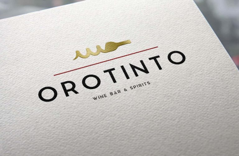
The logo system combines clean typography with a minimal graphic gesture inspired by the ritual of pouring wine. The restrained palette — black, white, deep tones and subtle gold accents — reinforces a sense of exclusivity and warmth.
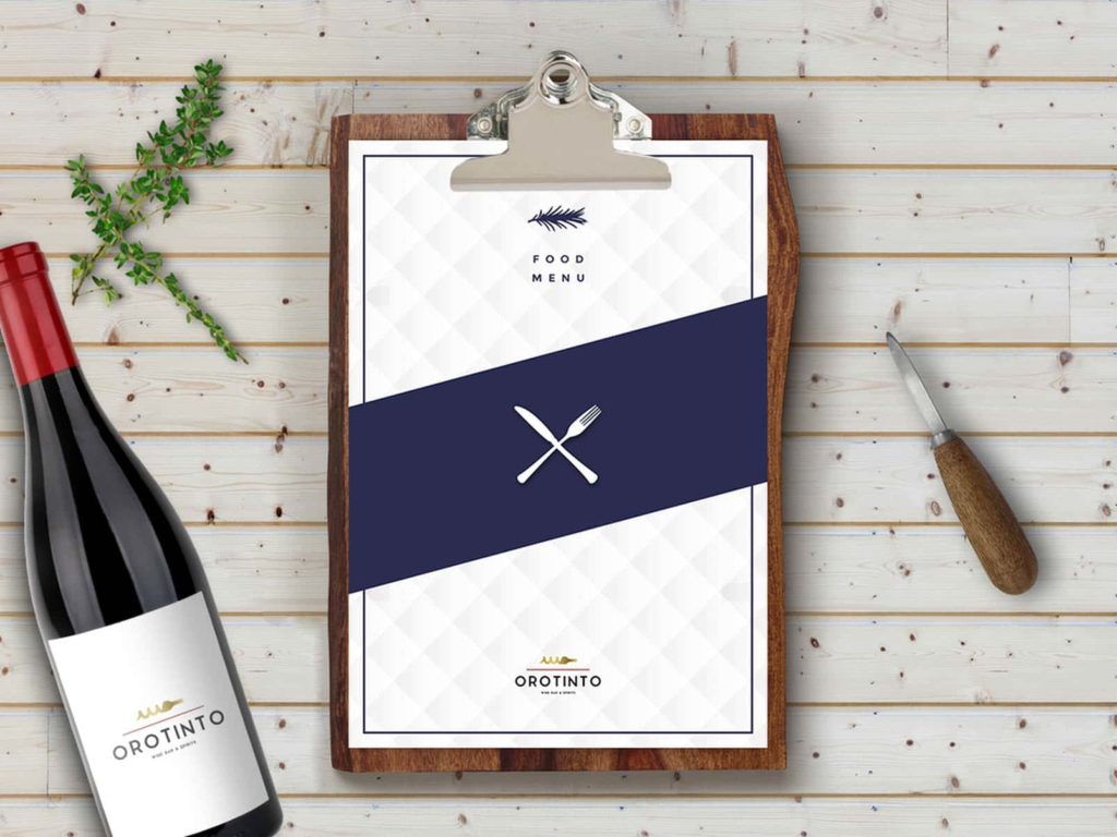
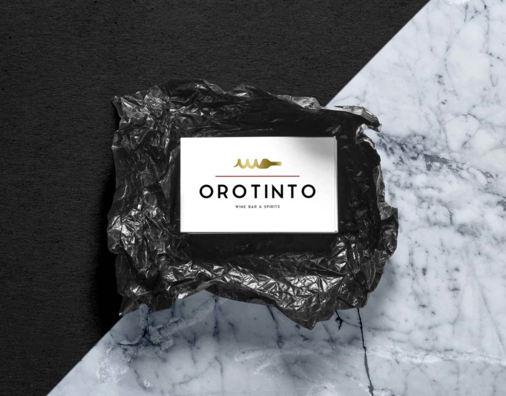
Every element was designed to feel intentional, from printed materials to menu layouts, ensuring coherence across touchpoints.
Texture, paper selection, and layout composition were considered essential parts of the brand experience. The result is a visual identity that feels tactile, curated, and aligned with the atmosphere of a contemporary wine bar.