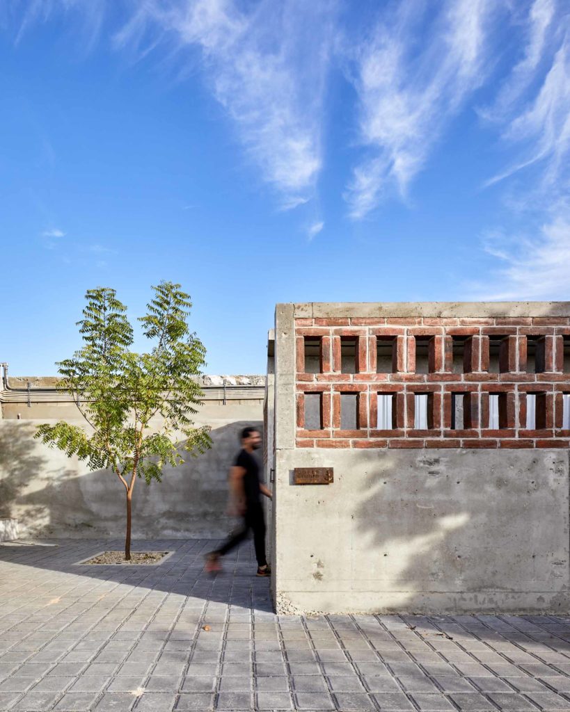
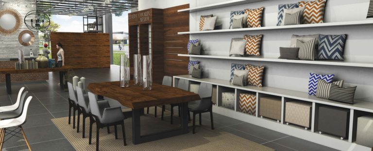
Author: Joss Manriquez

PLAZA ROBERTS

PLAZA ROBERTS

A RAW DIALOGUE BETWEEN BRICK, CONCRETE & SKY

“Even the most functional spaces deserve thoughtful design — because every detail shapes the experience.”

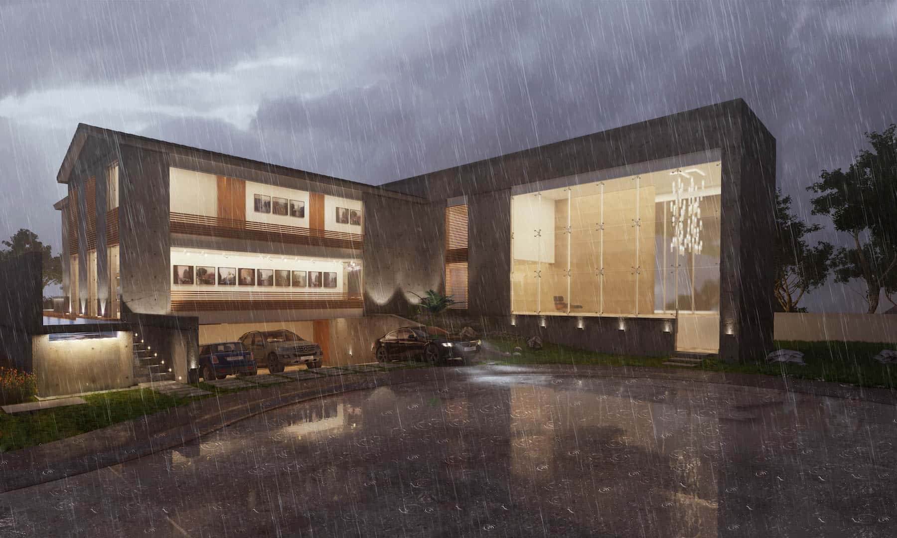
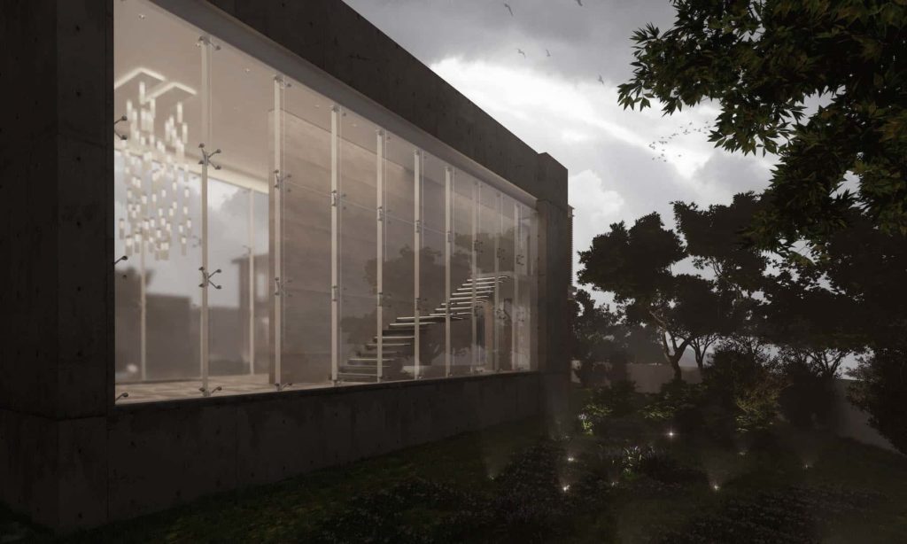
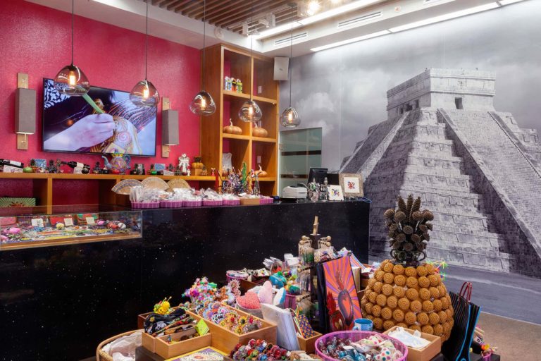
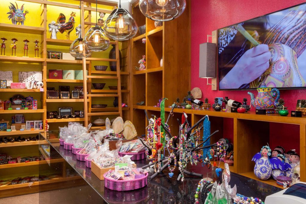
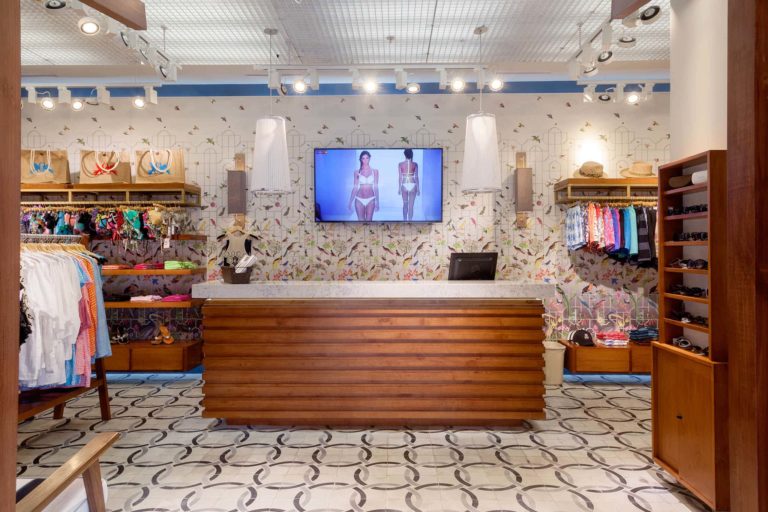
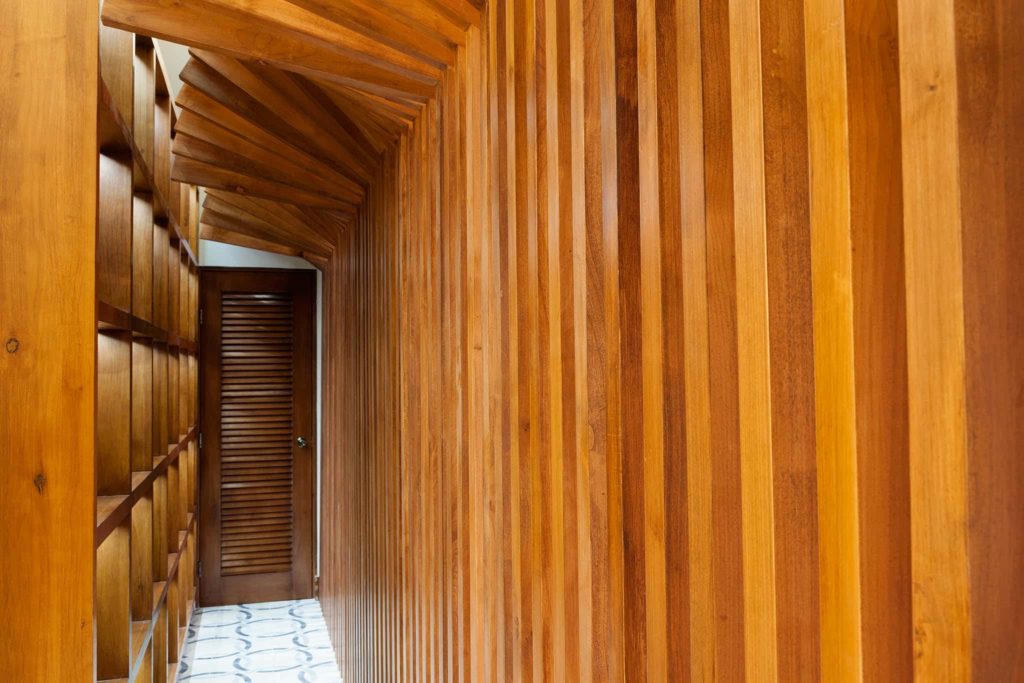
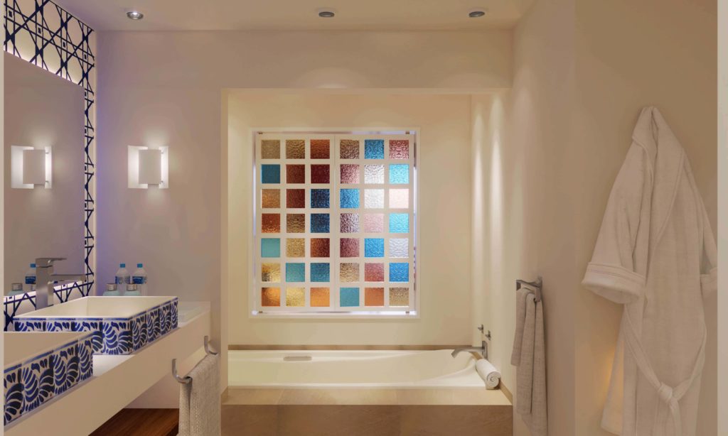
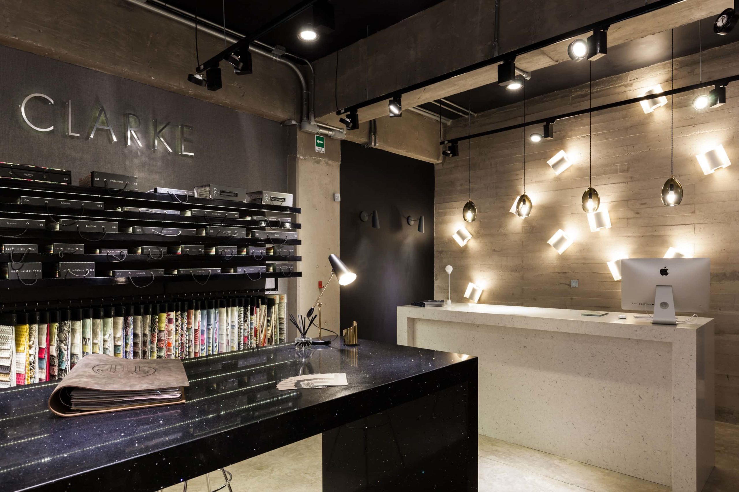
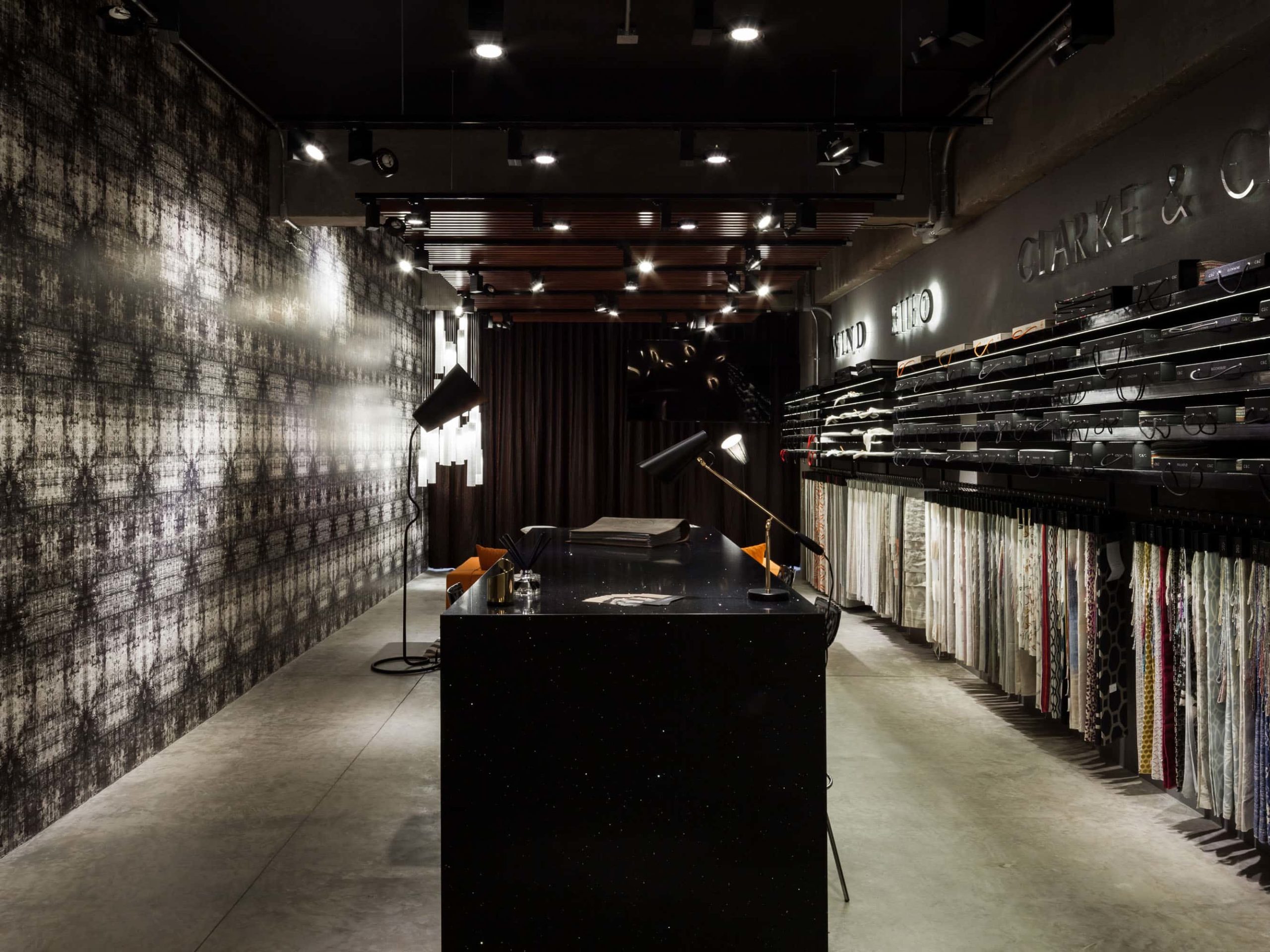
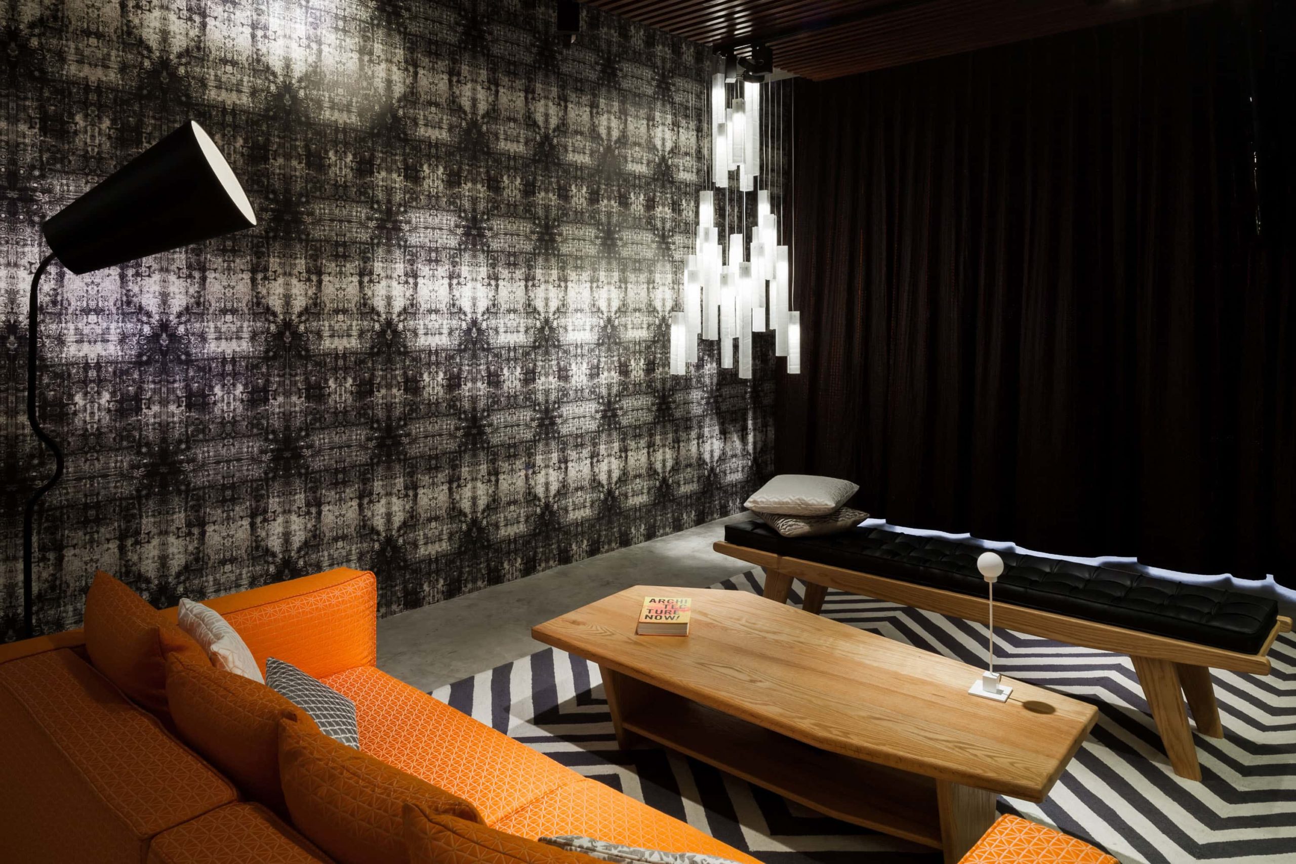
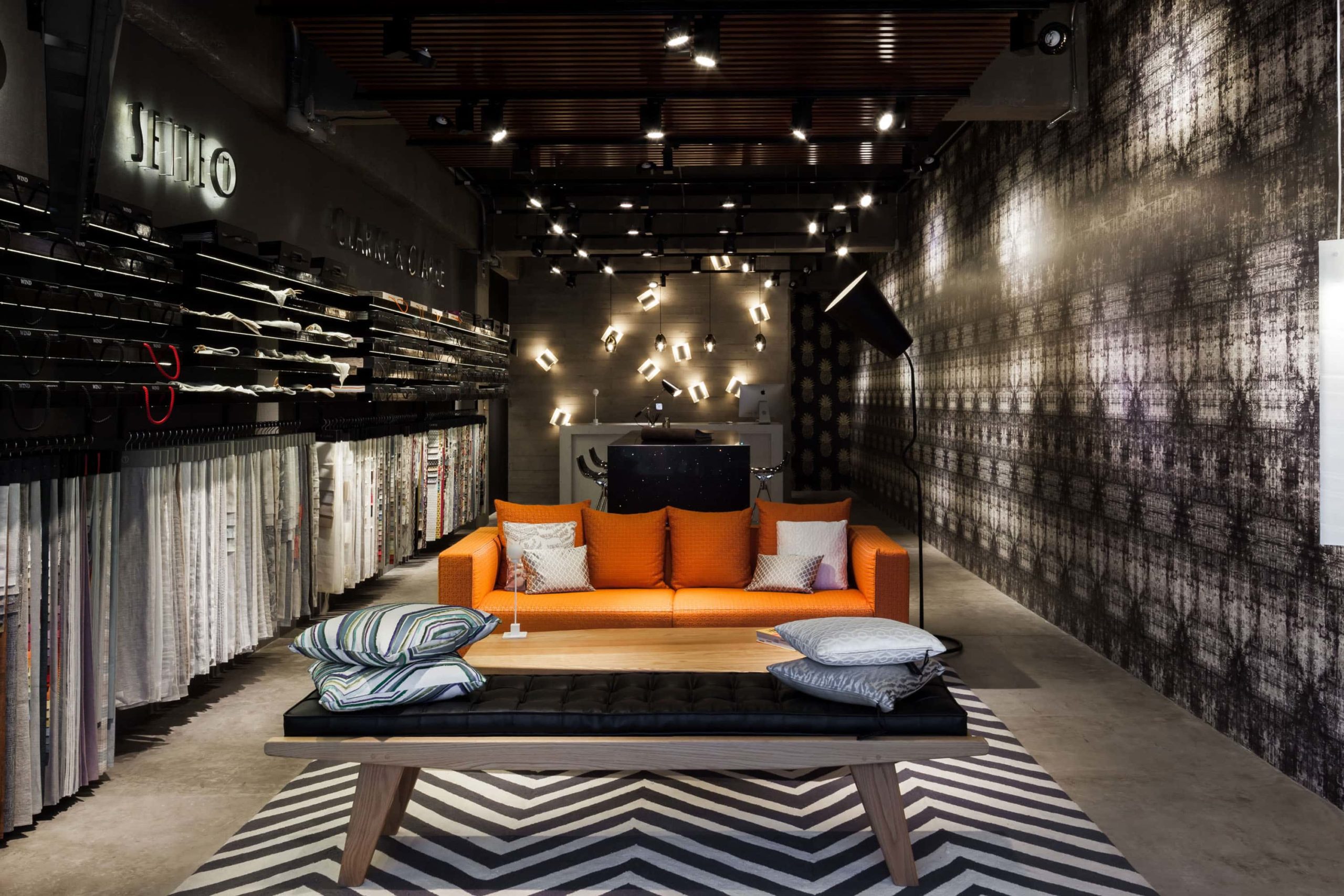
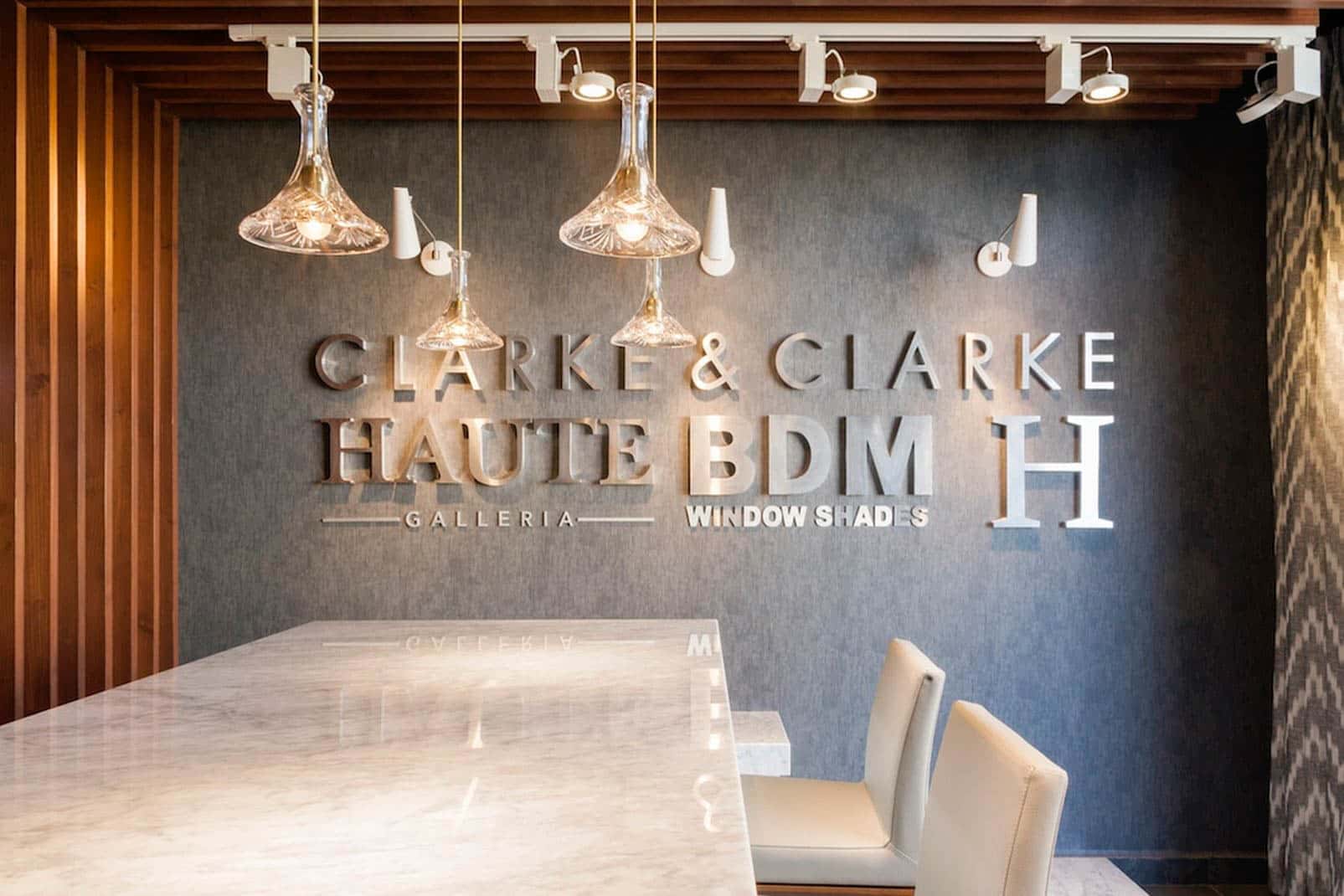
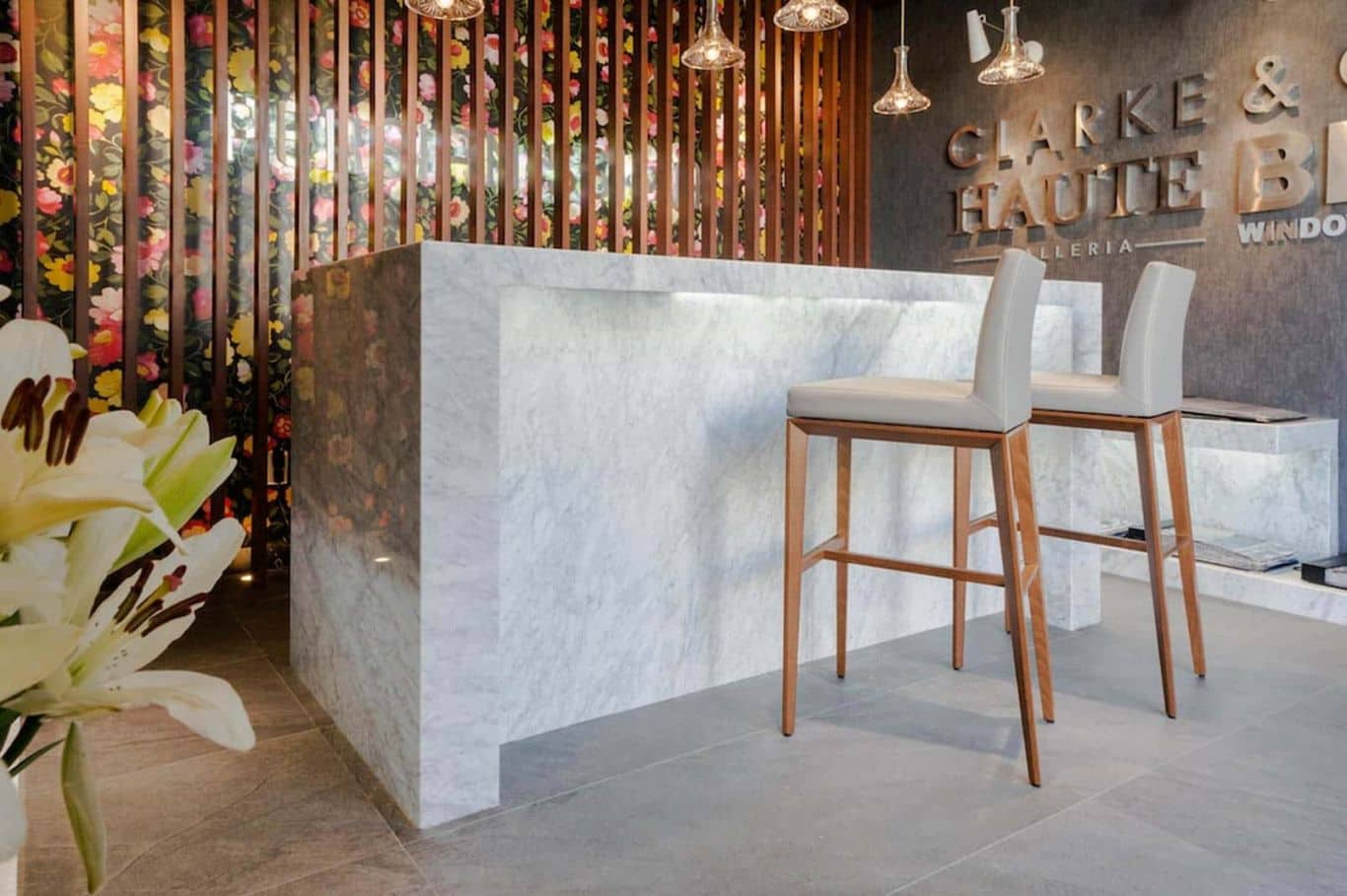
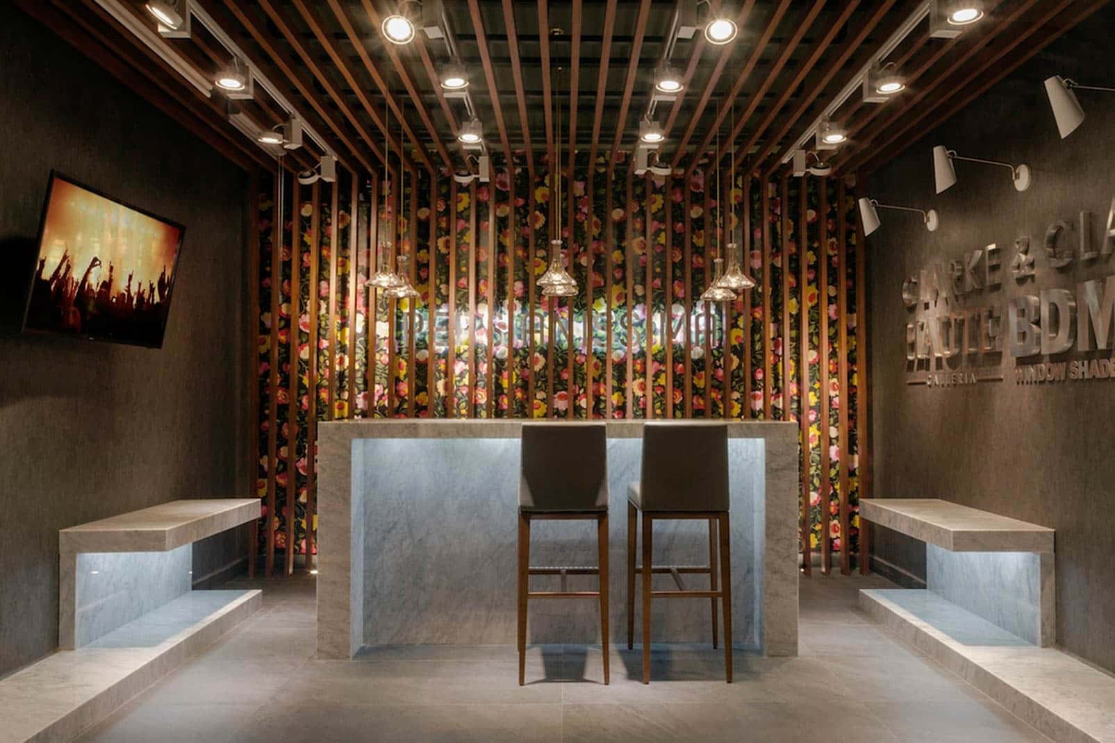
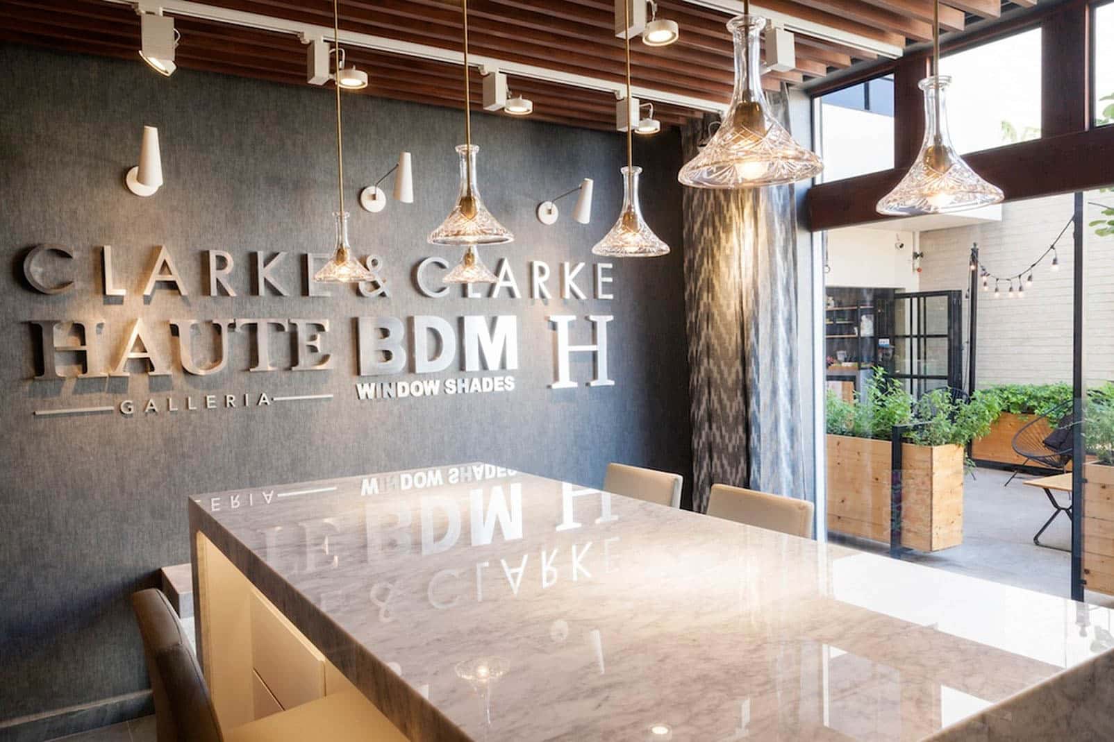
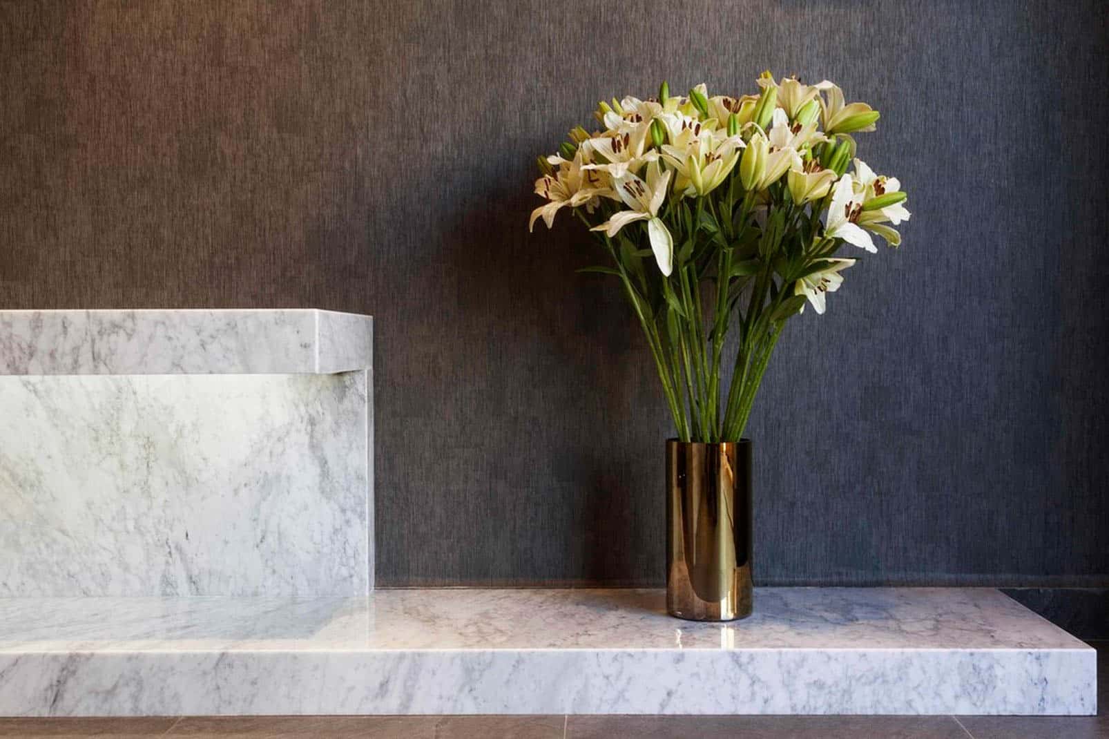
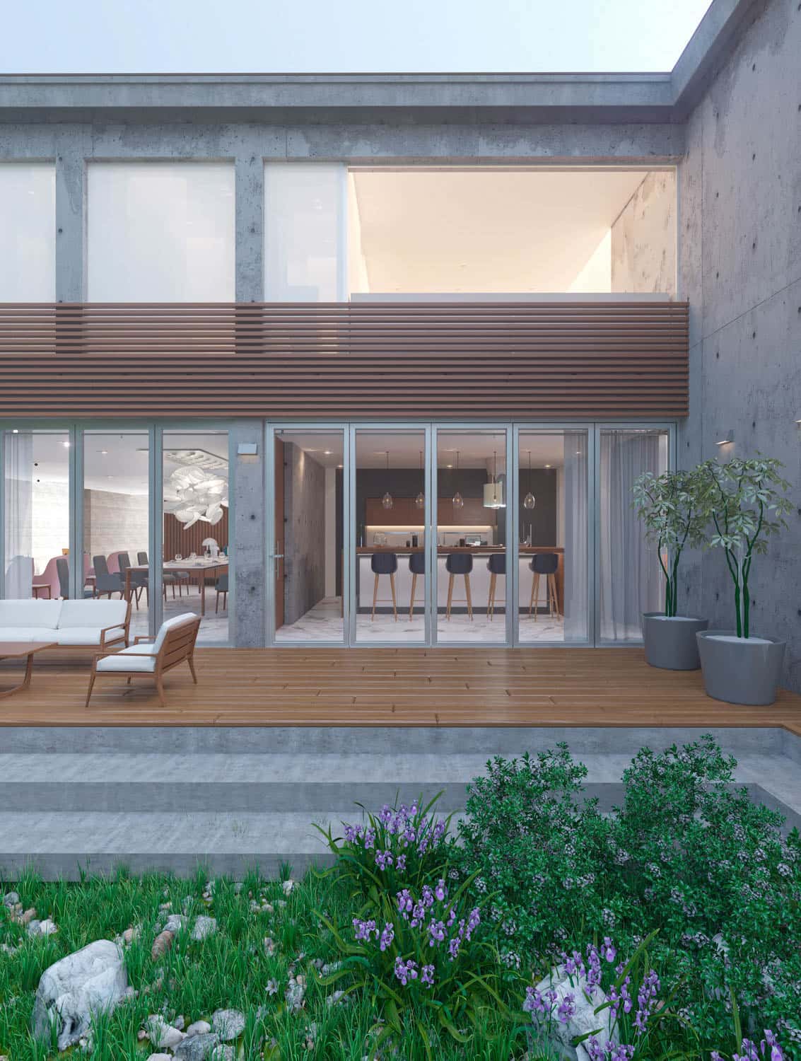
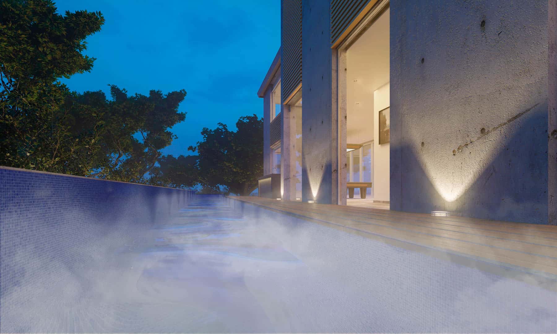
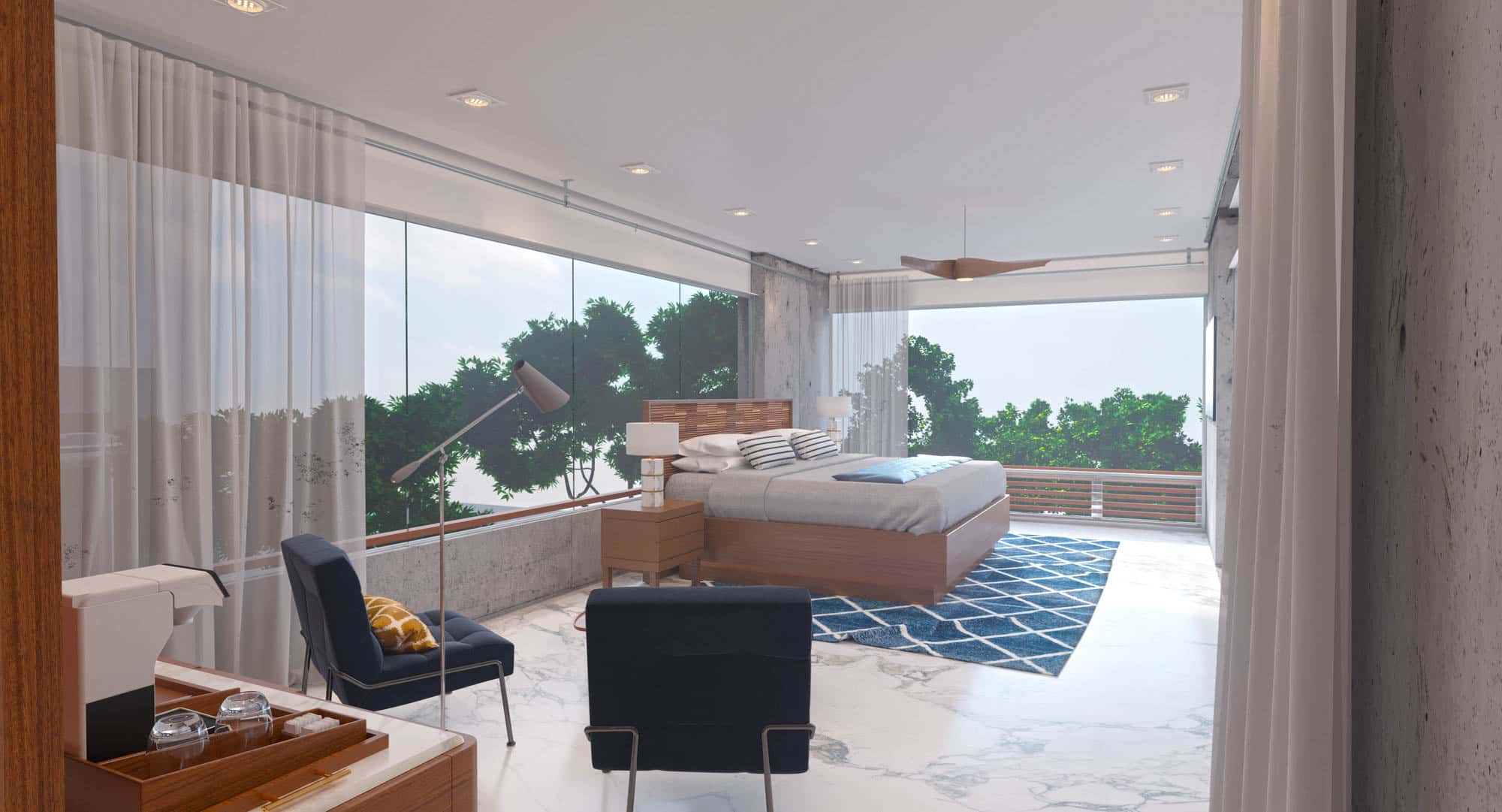
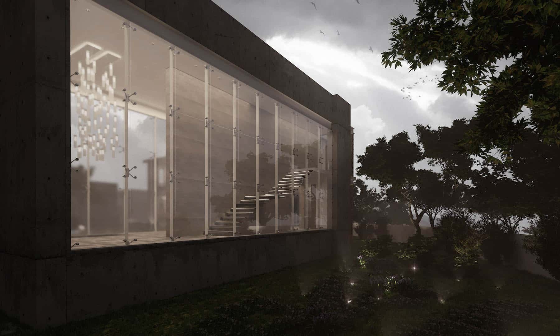
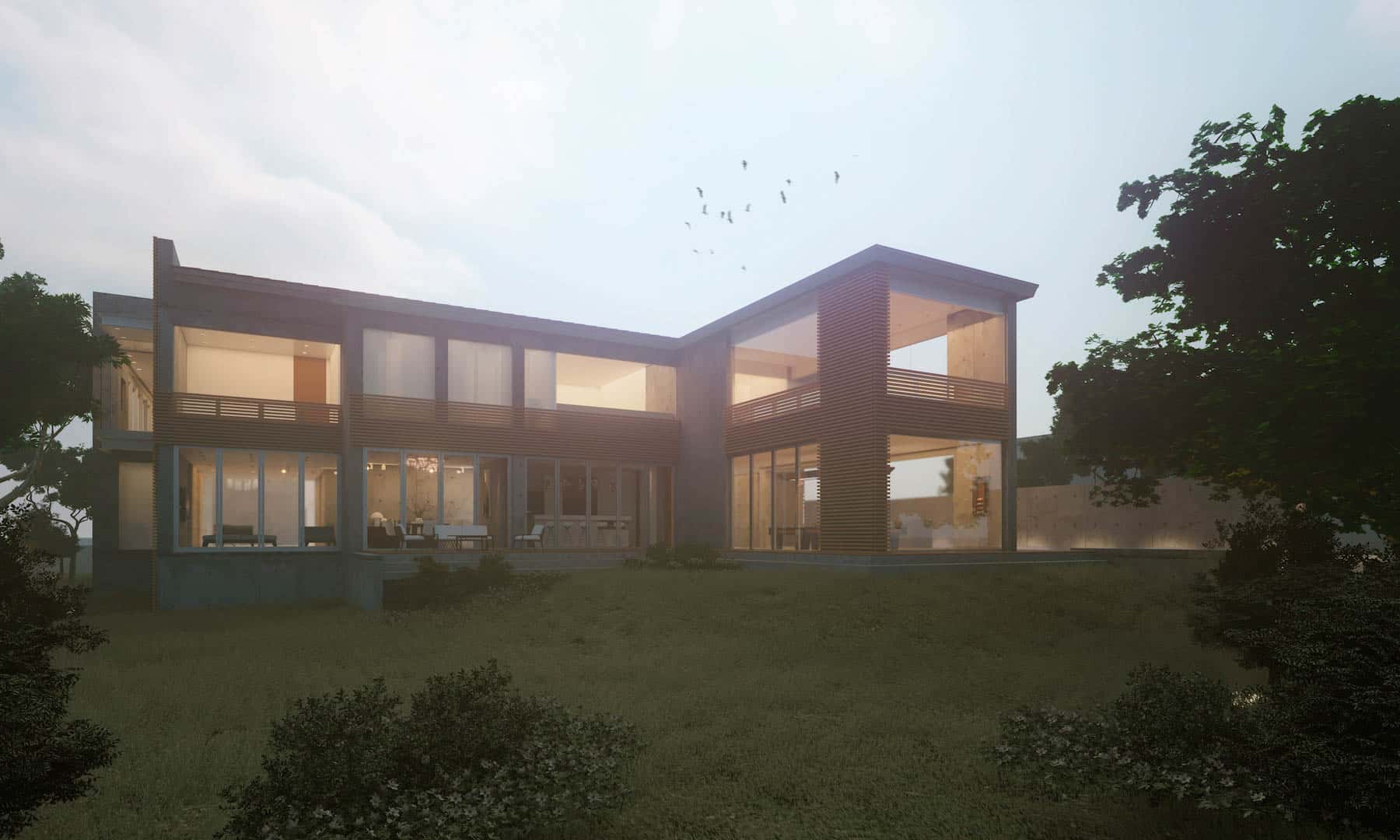
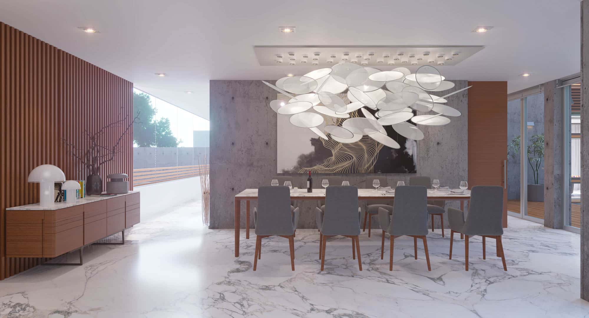
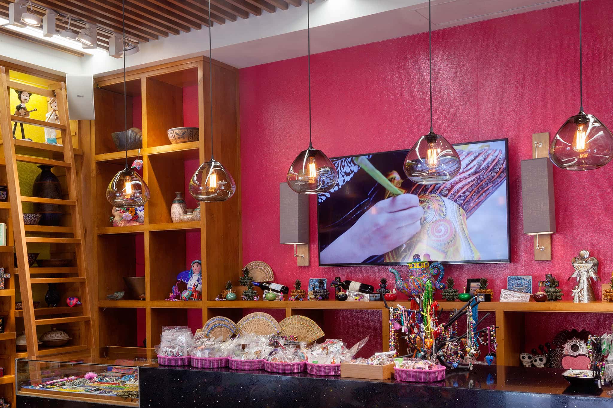
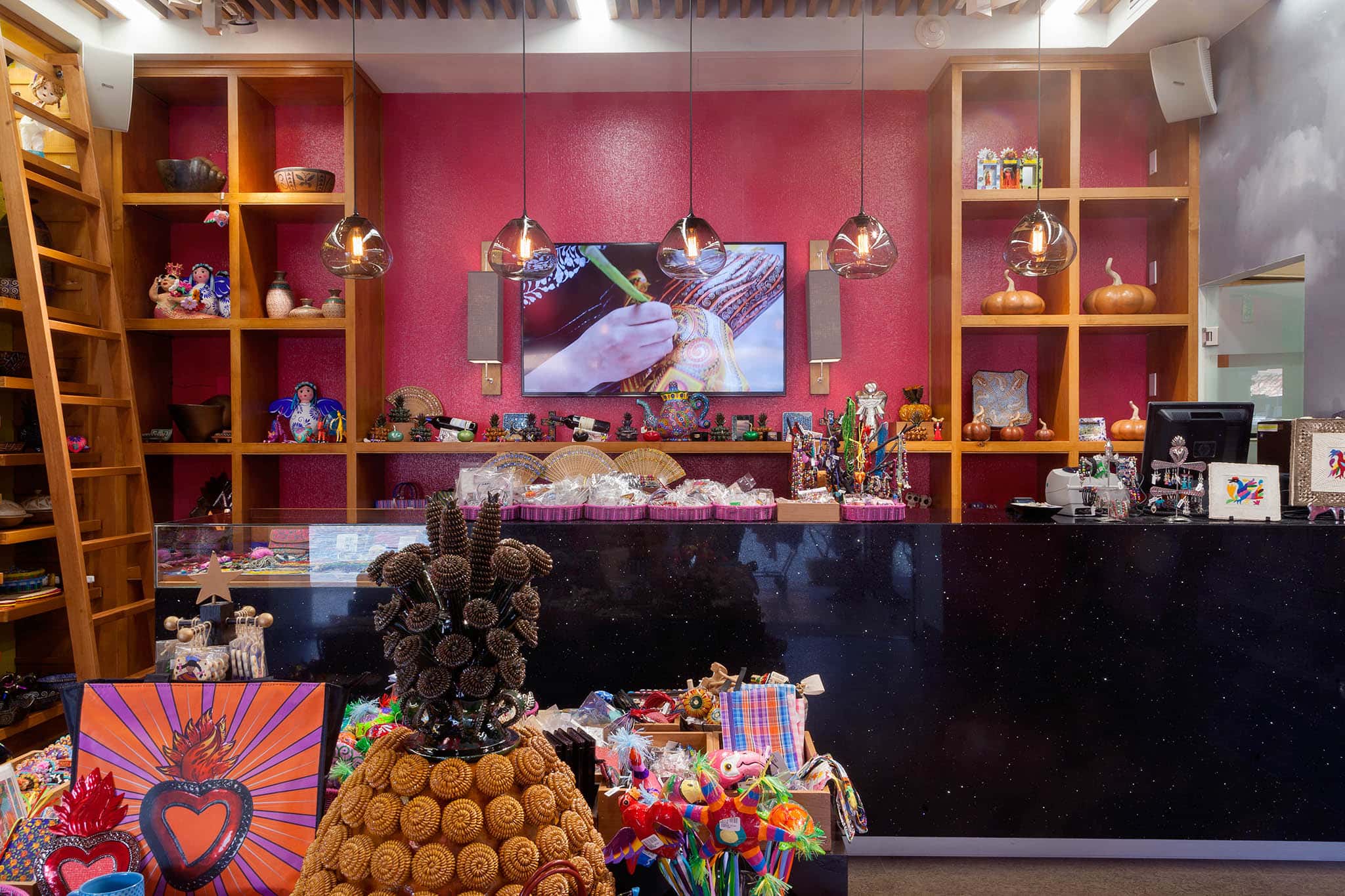
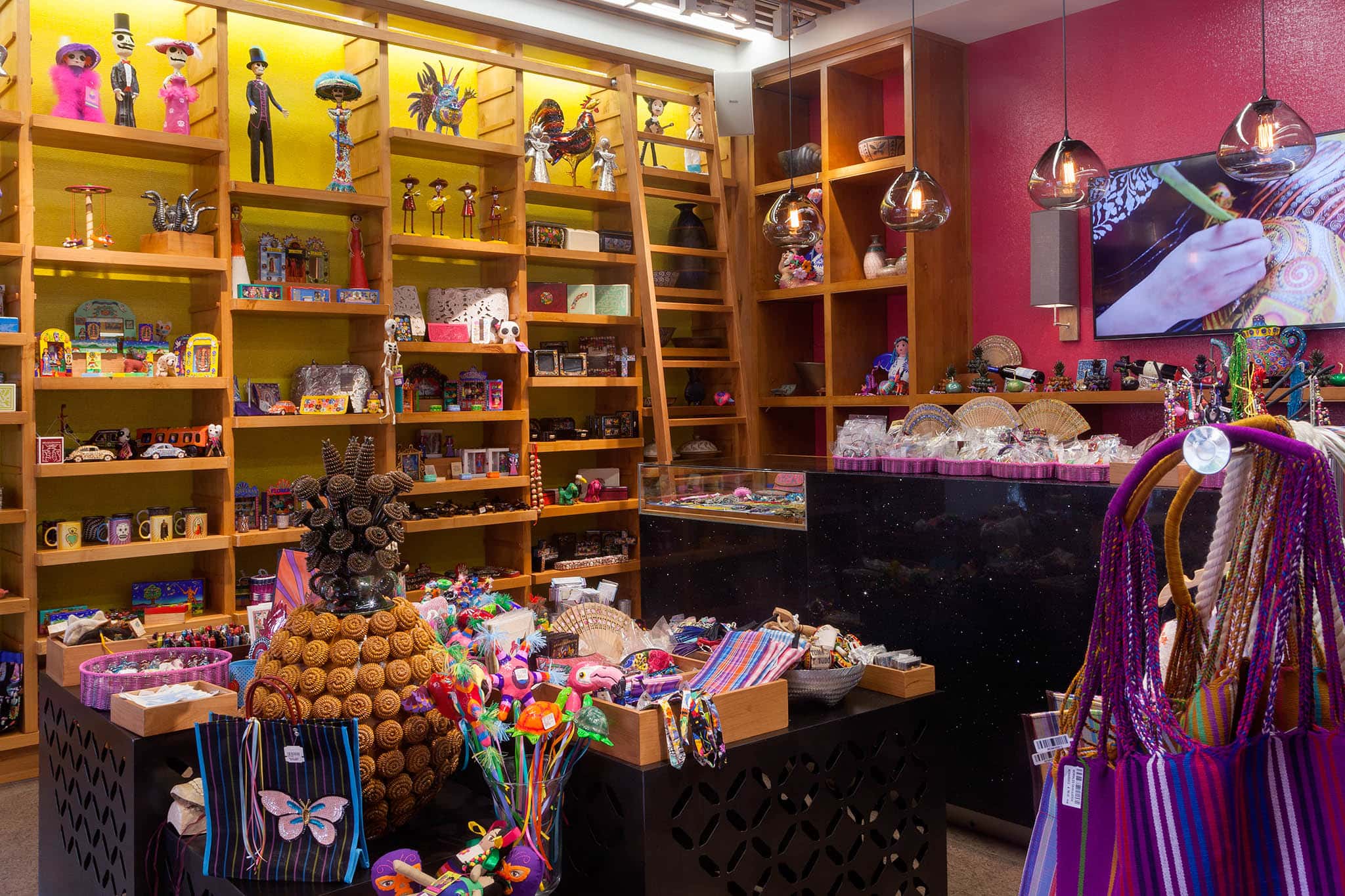
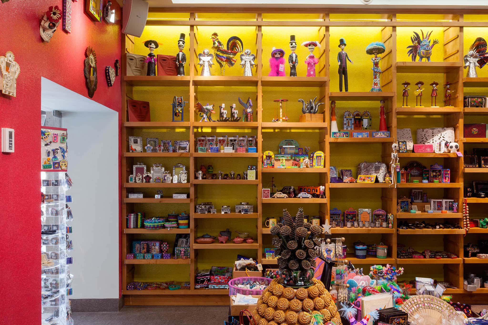
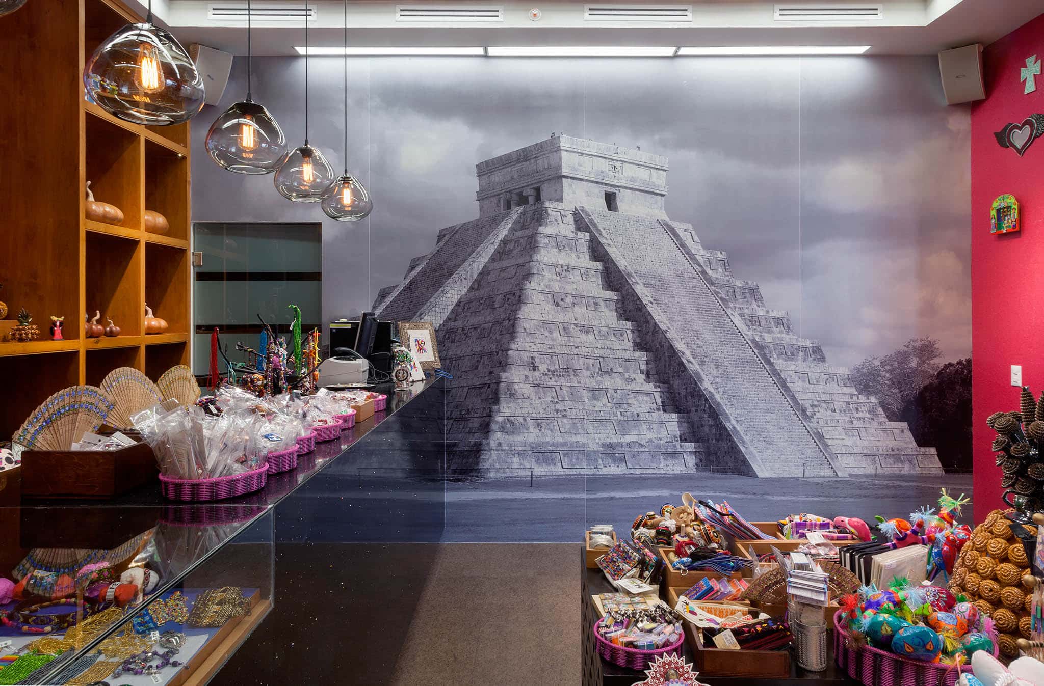
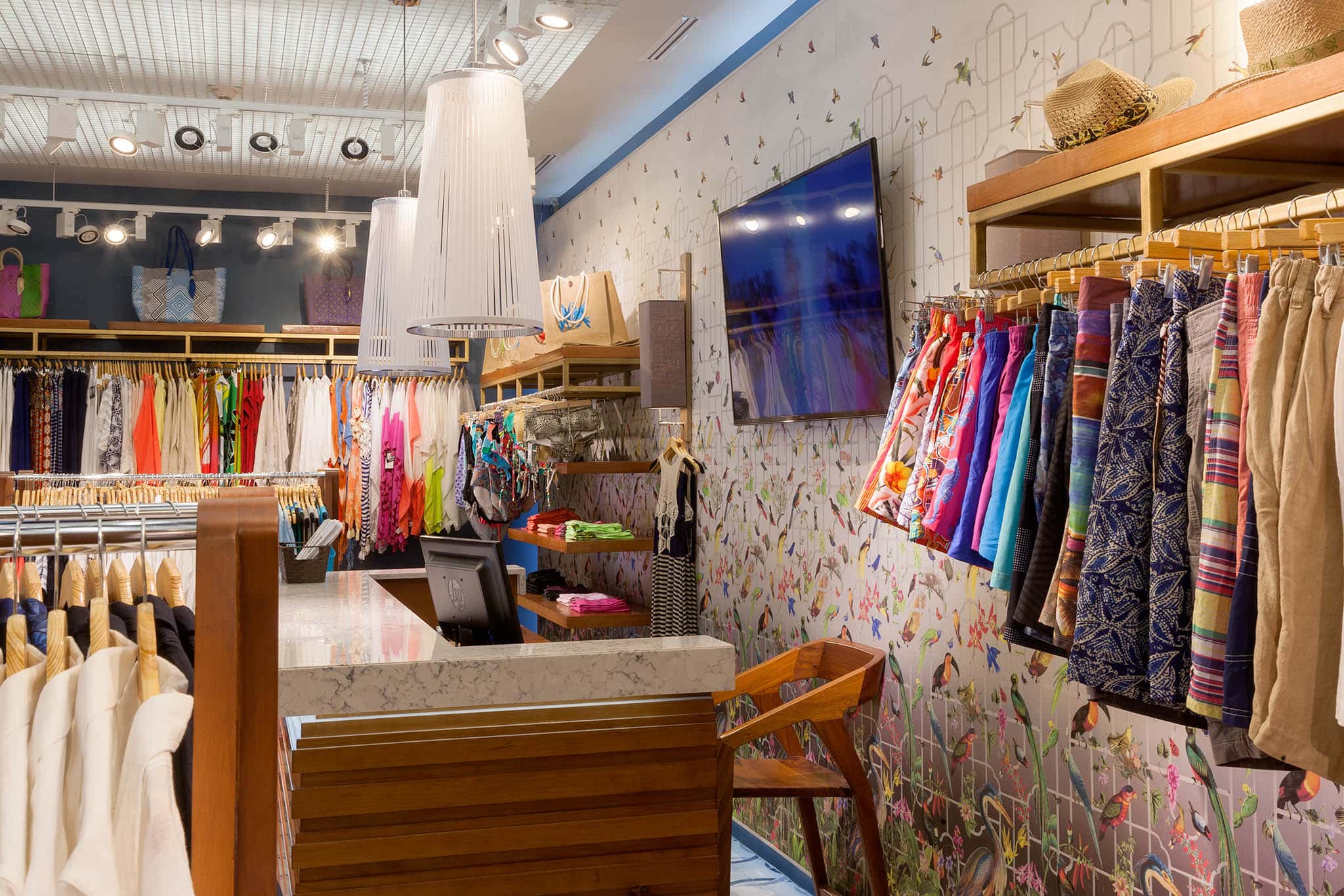
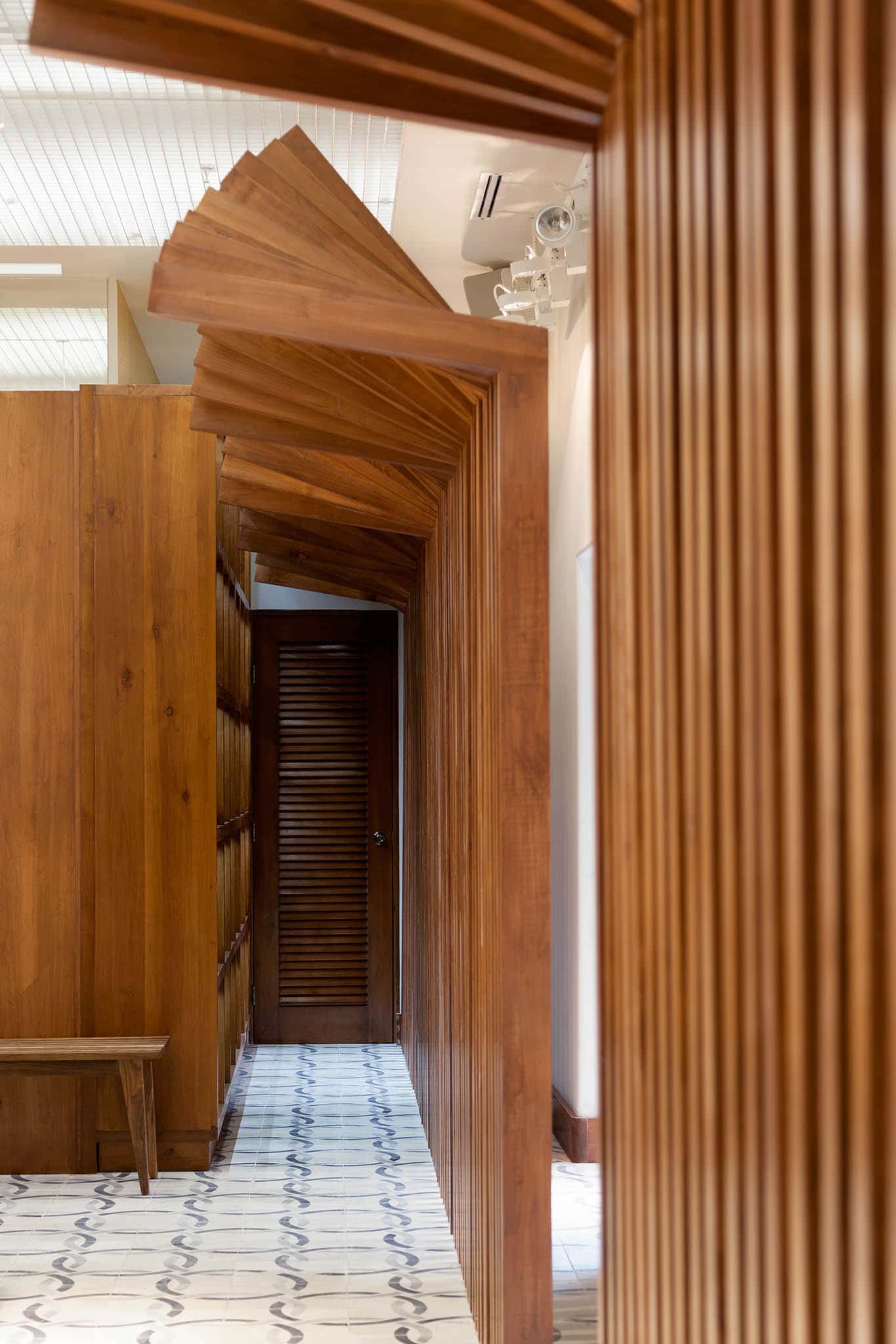
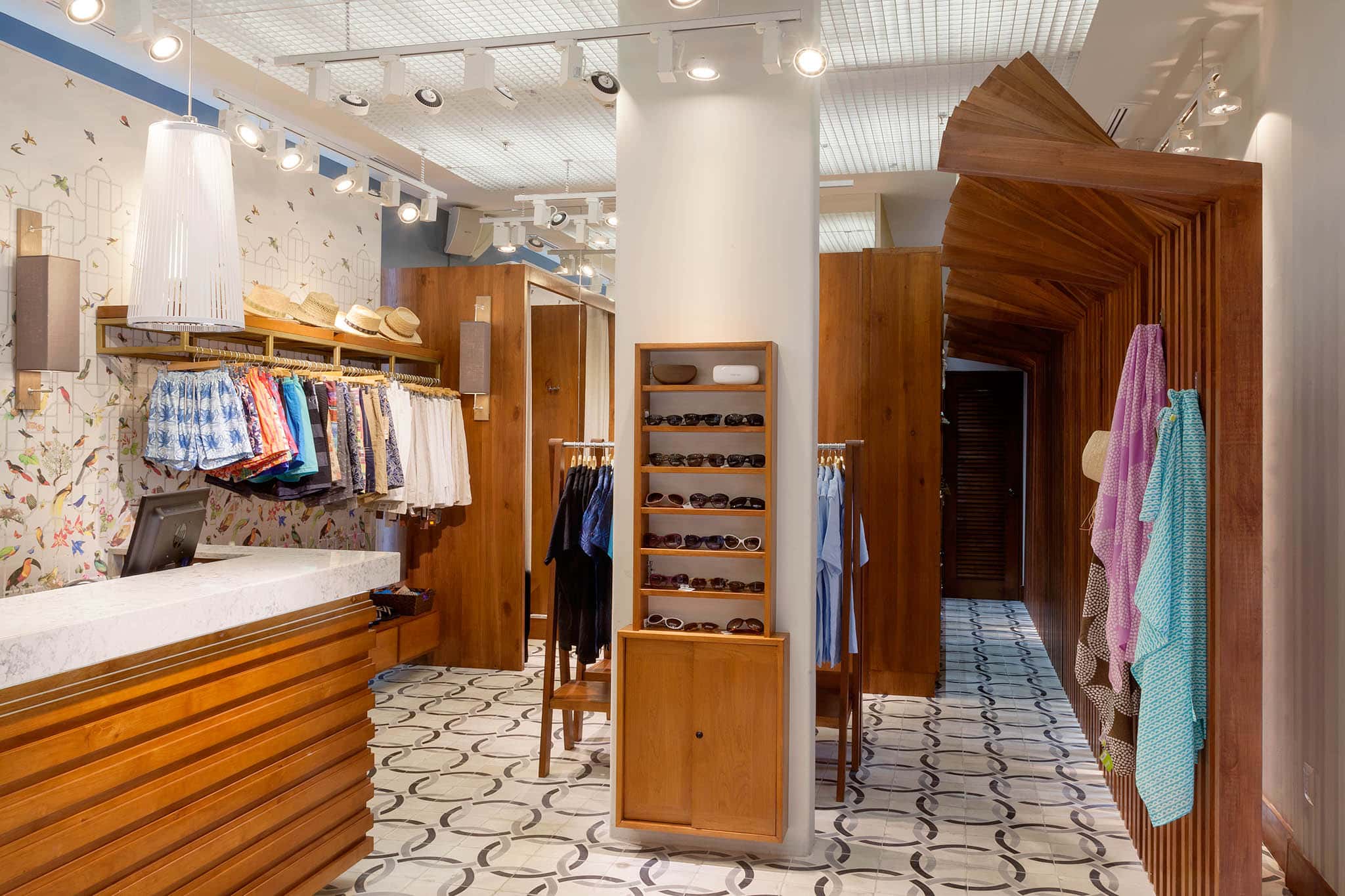
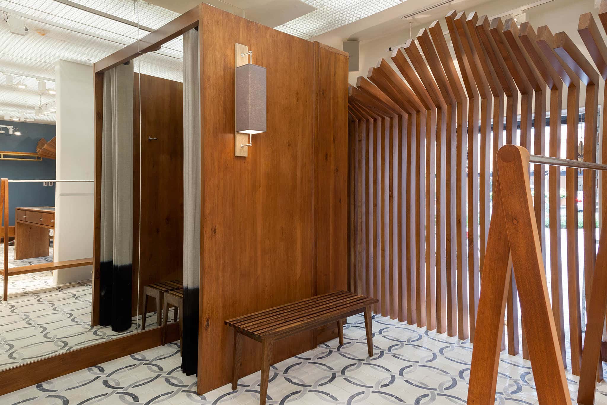
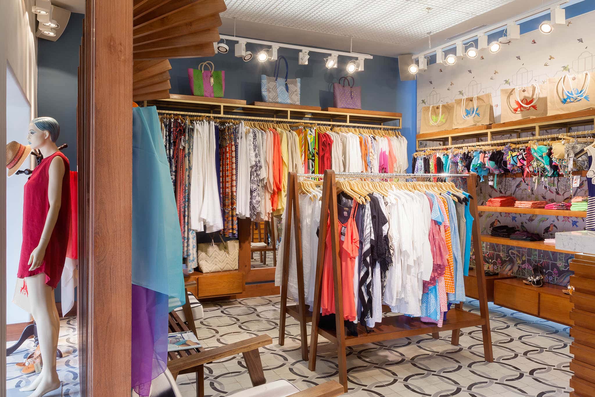
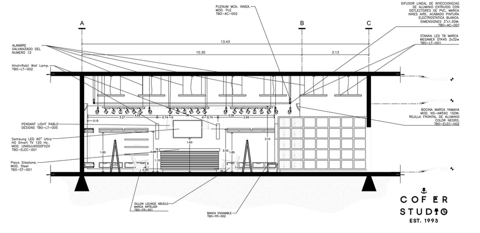
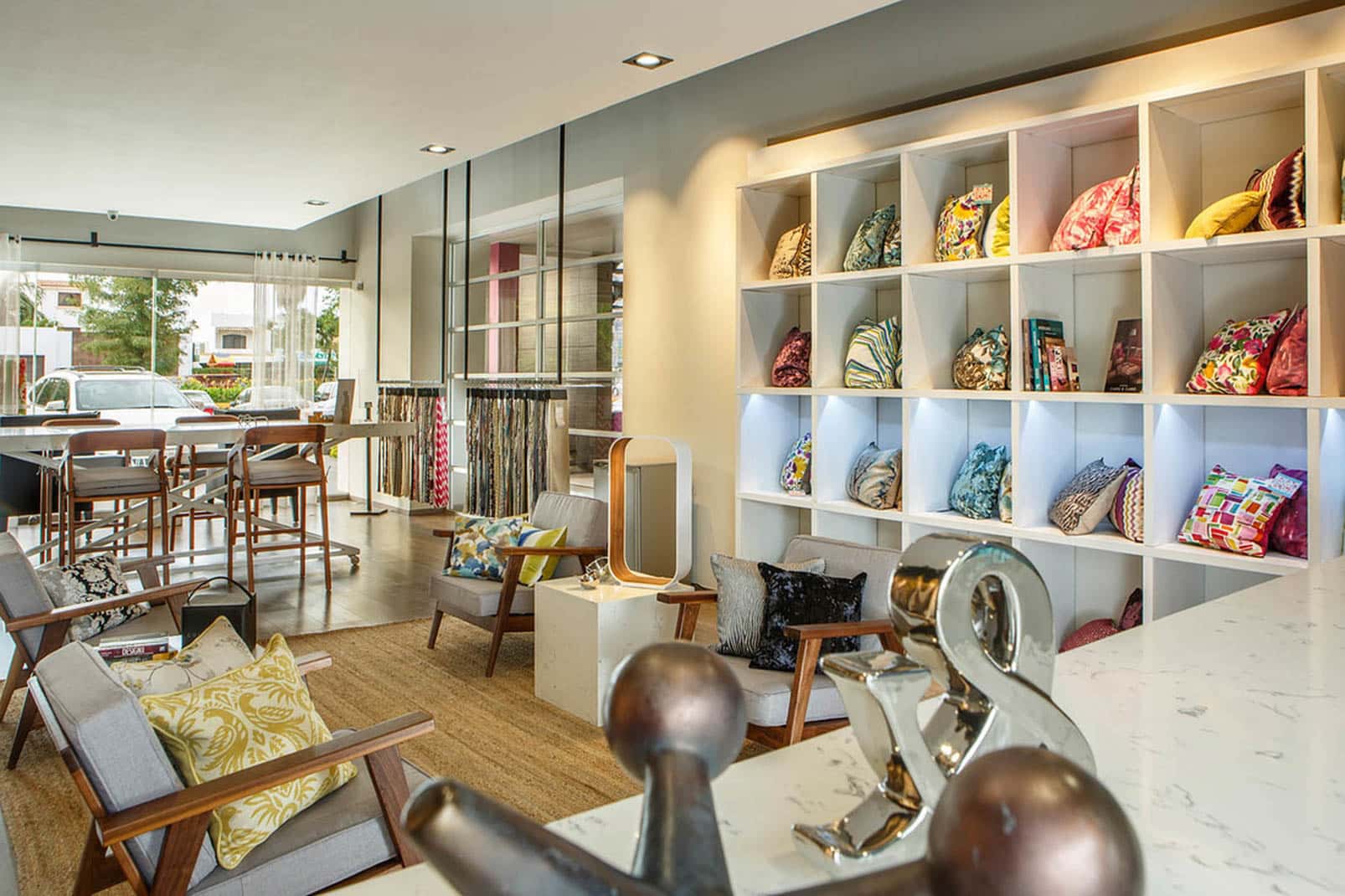
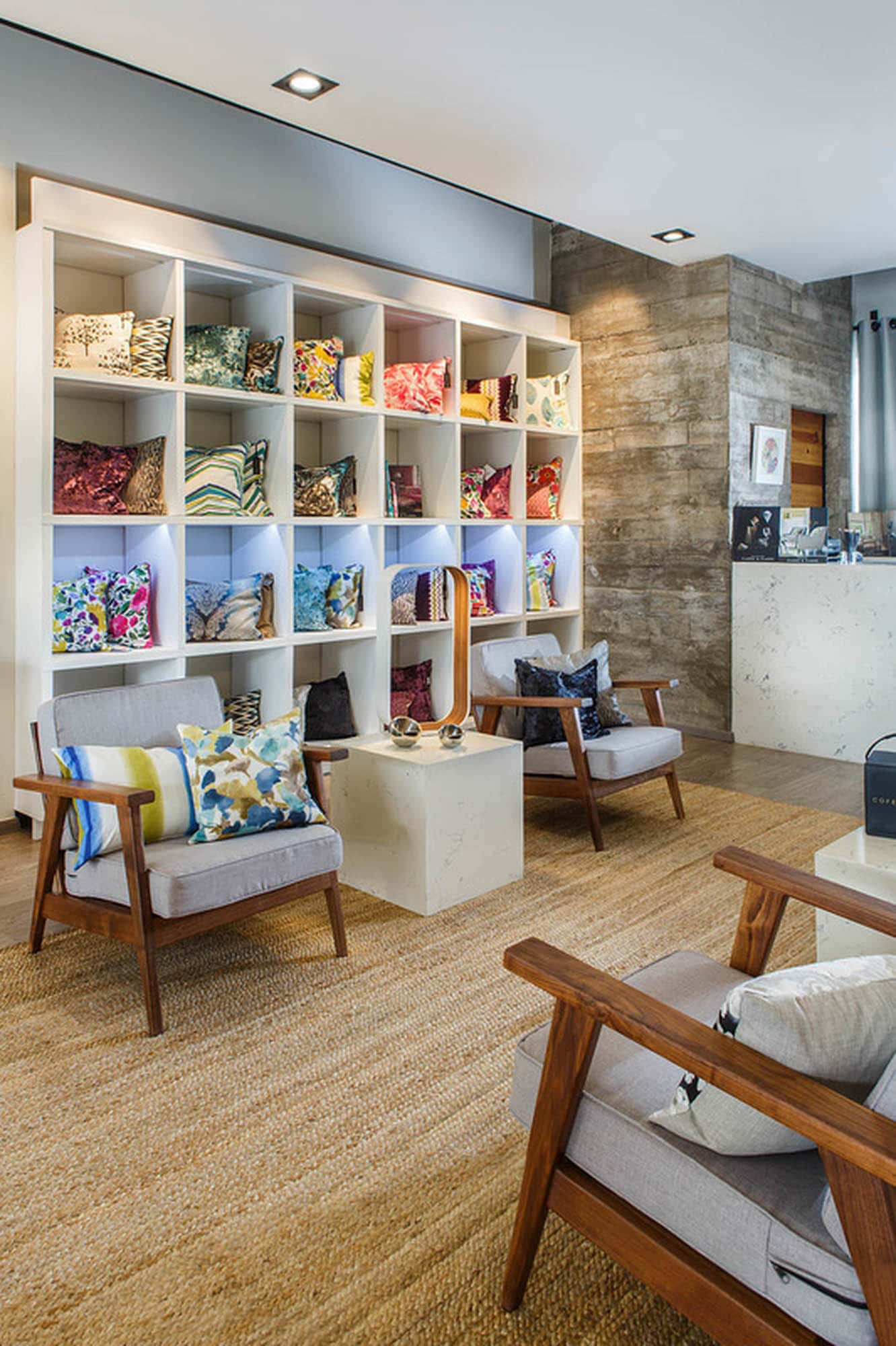
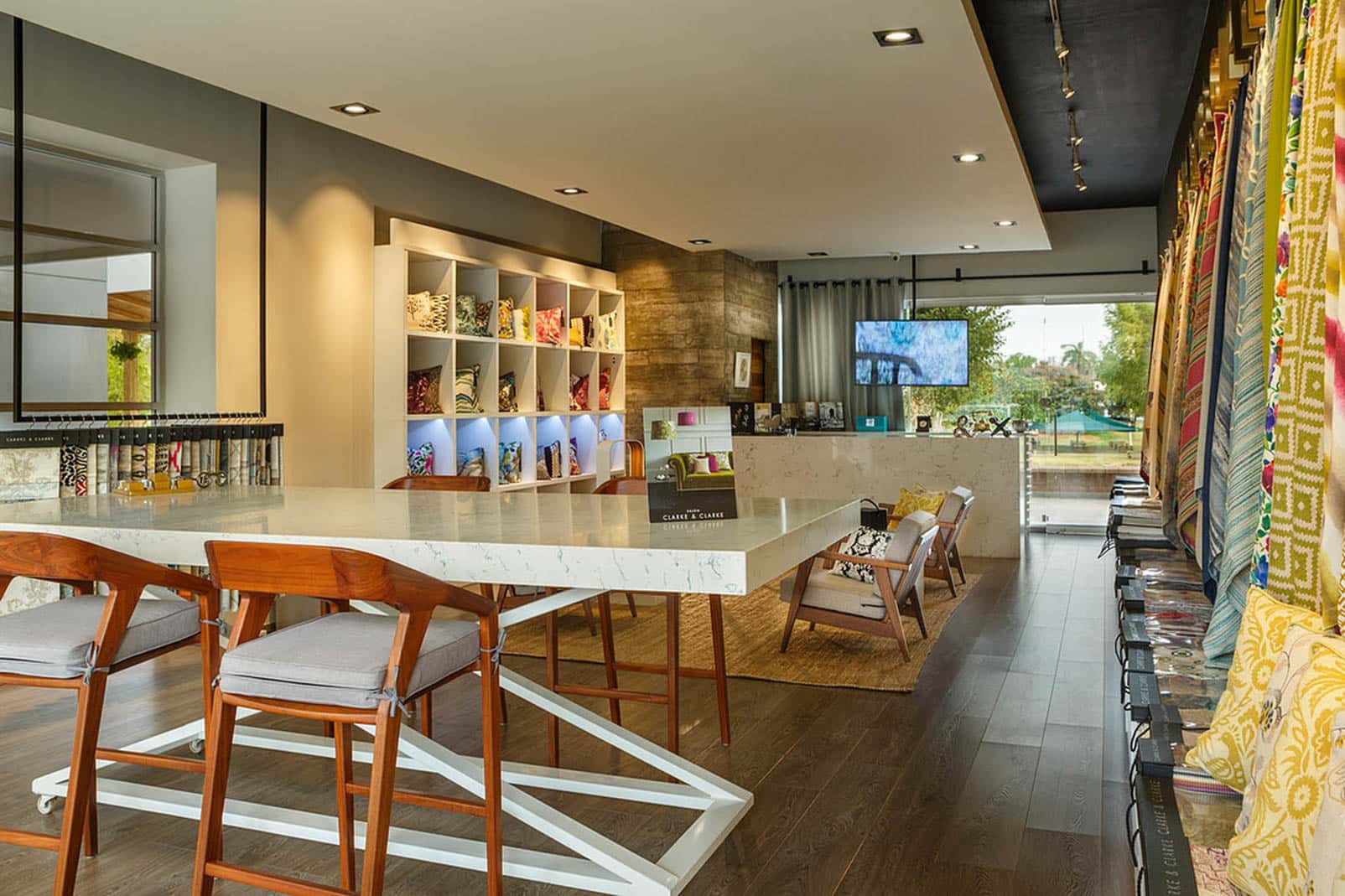
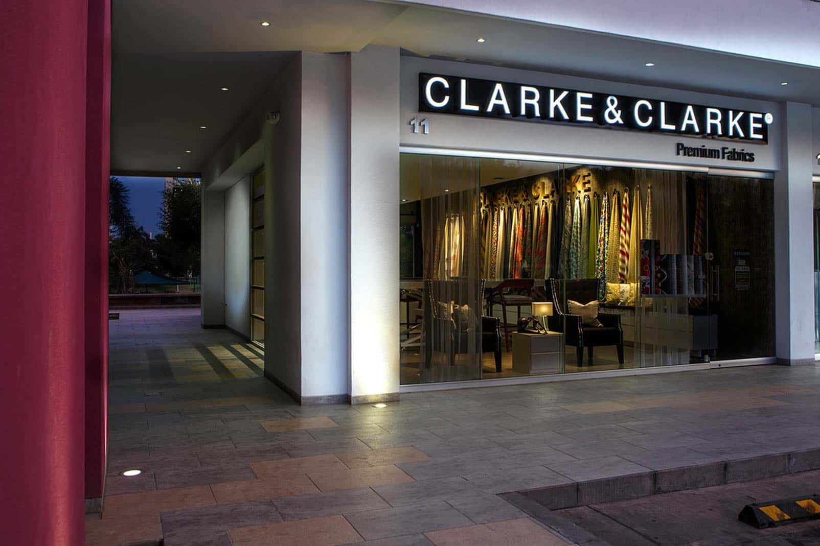
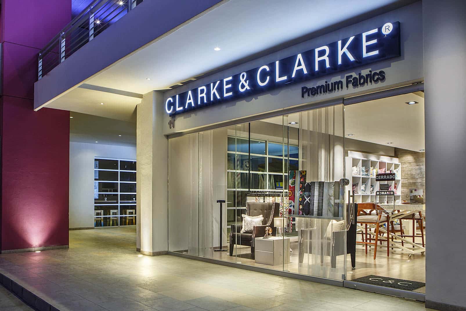
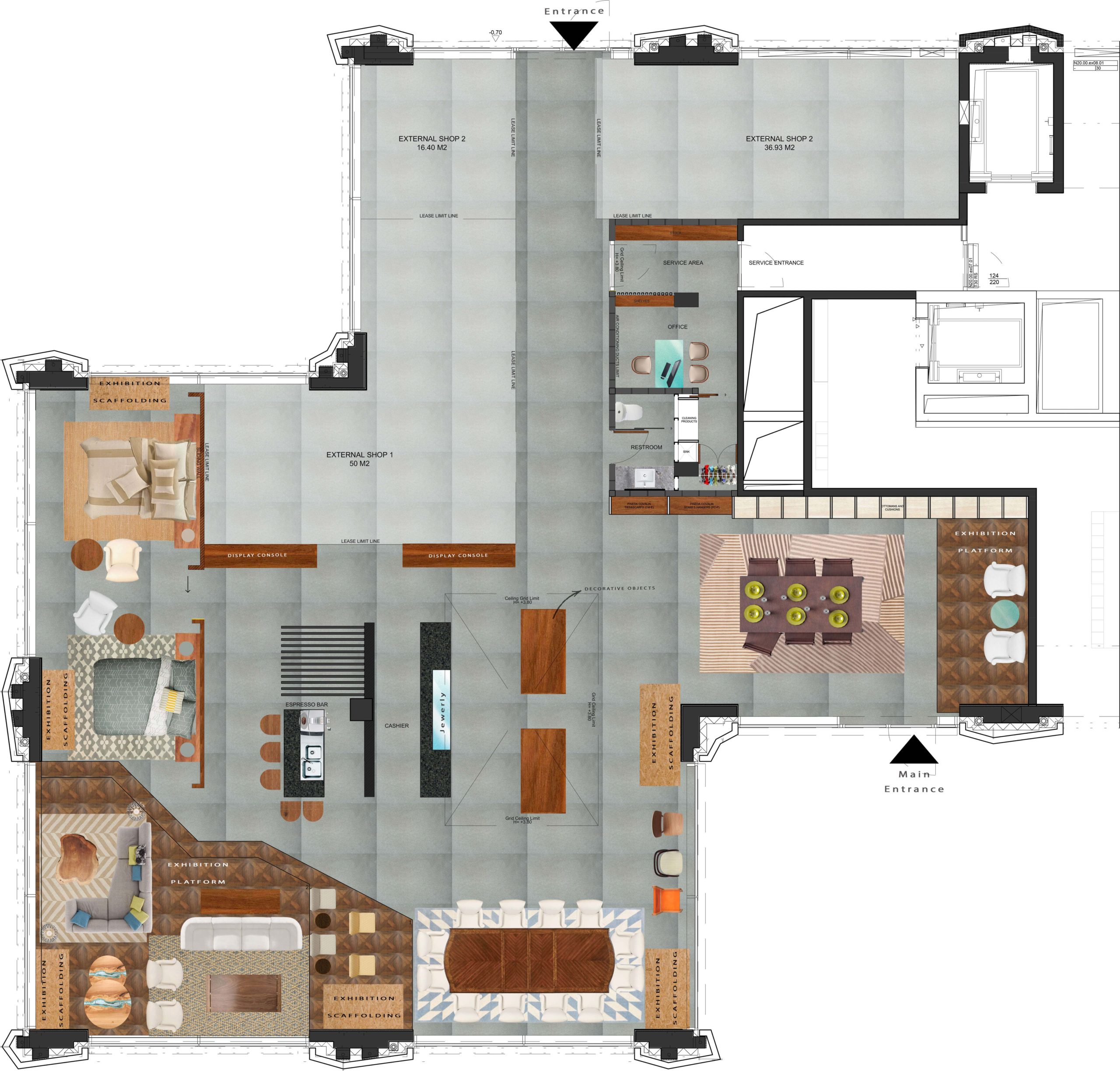
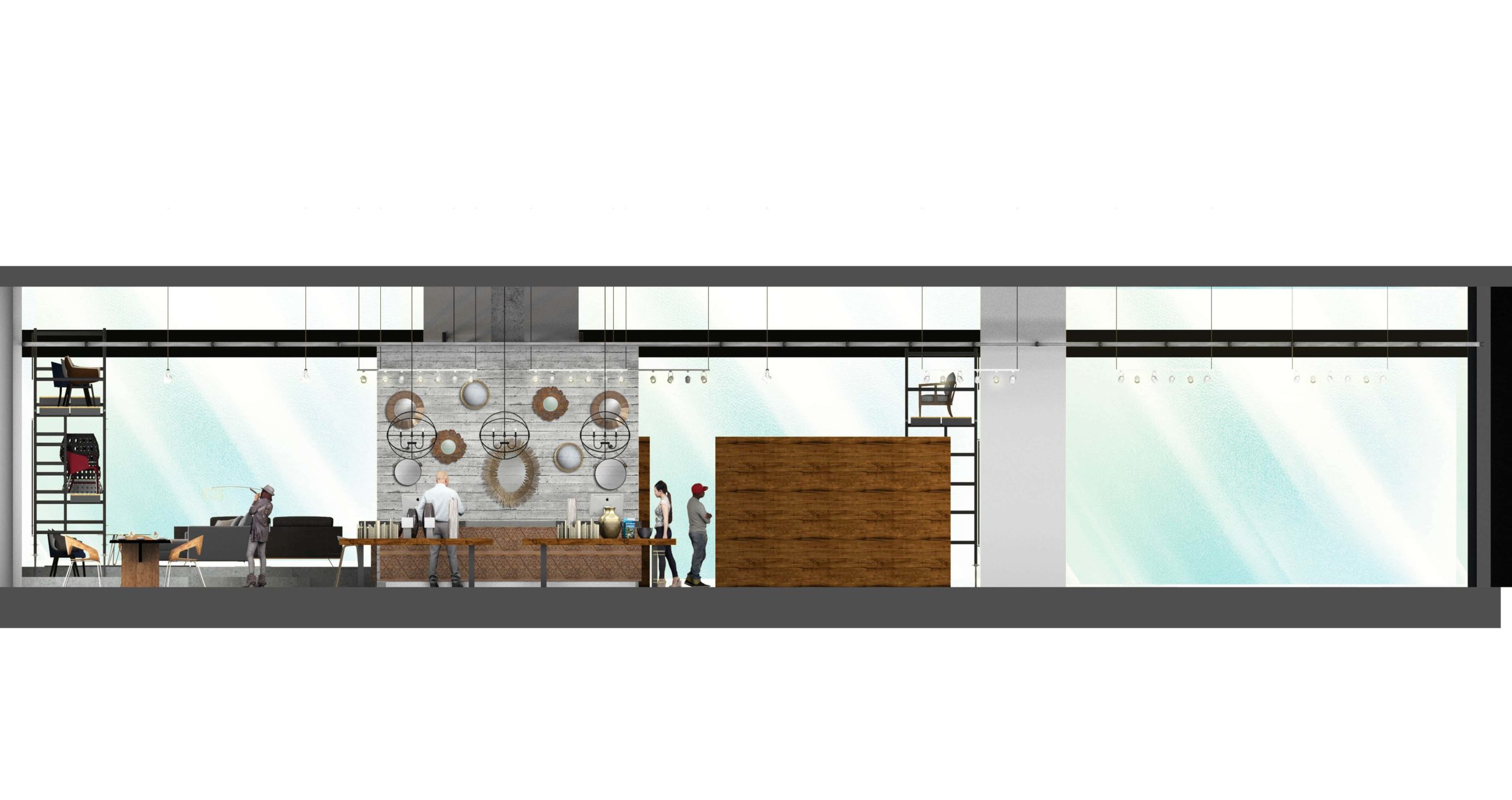
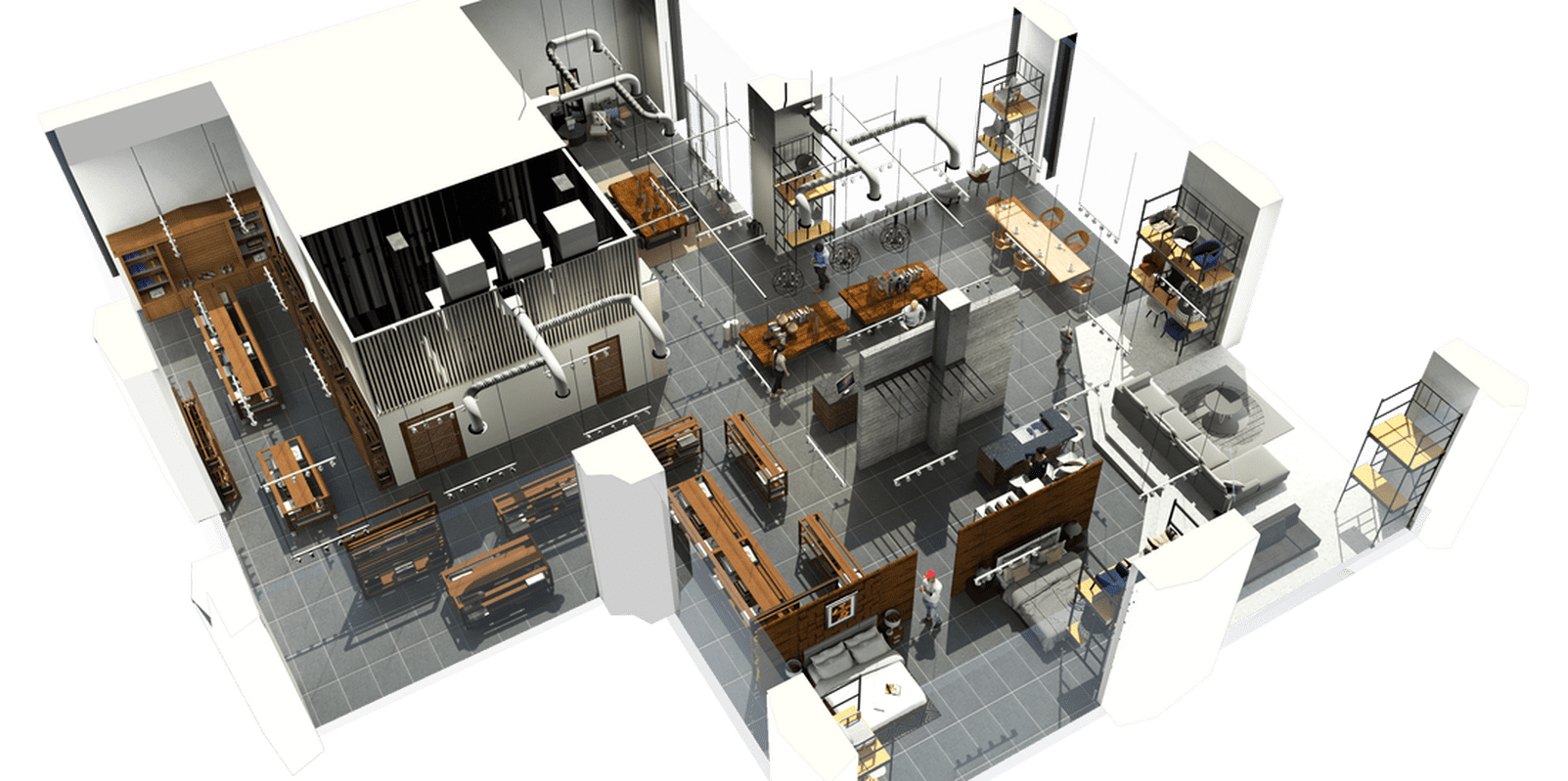
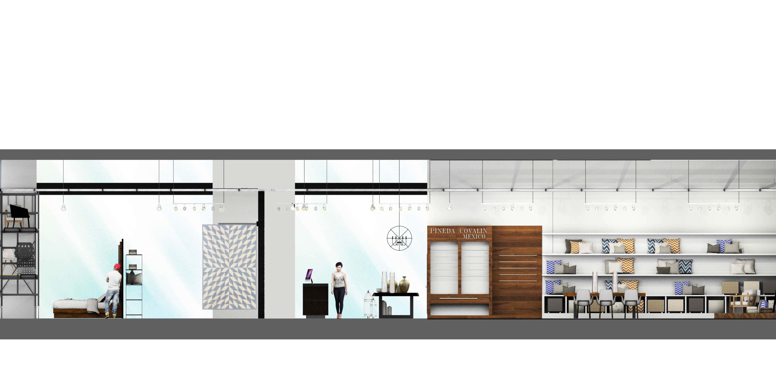
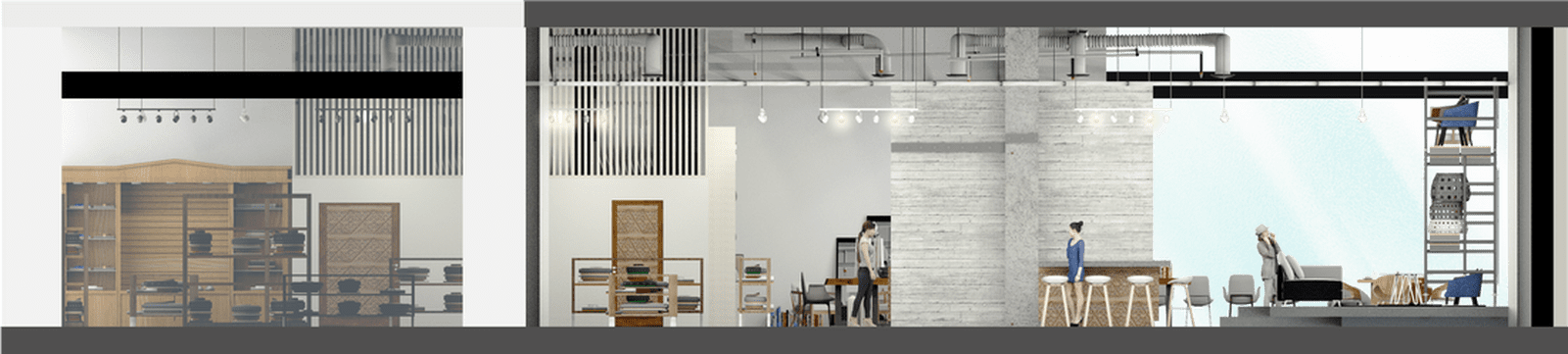
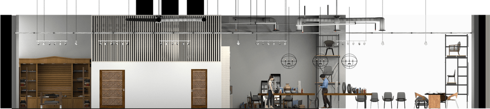
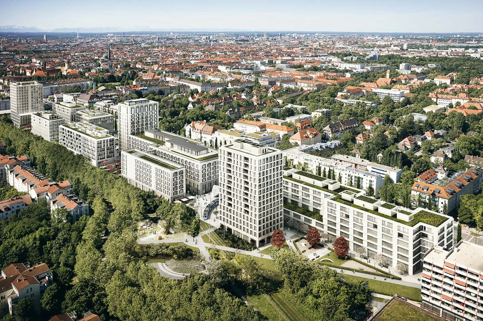
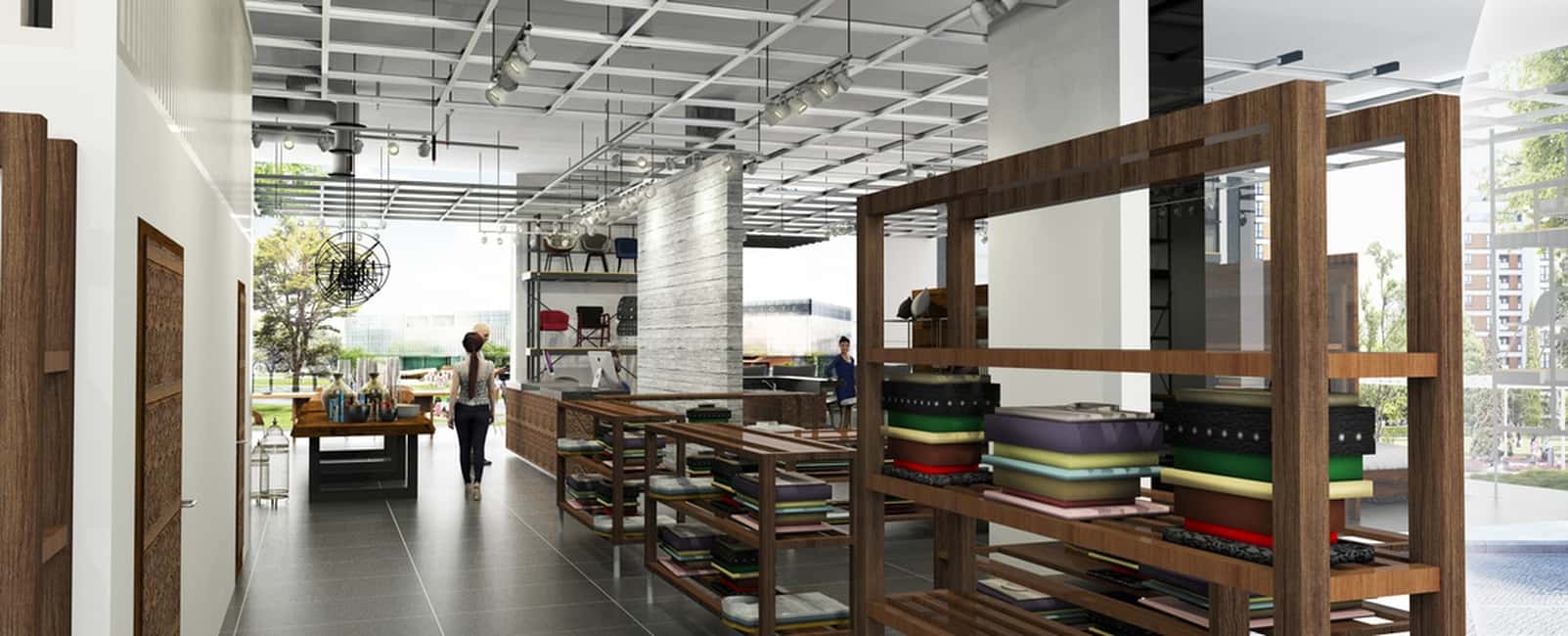
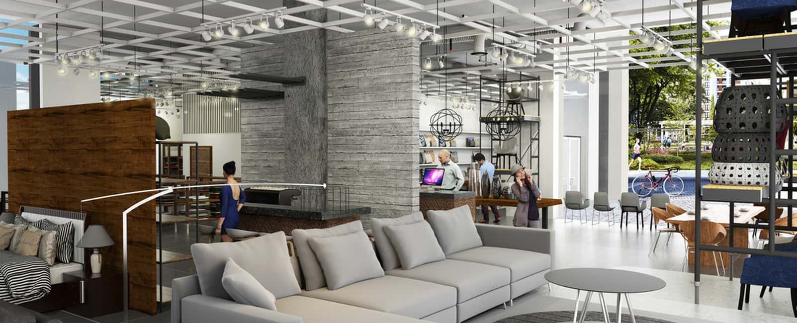
For Plaza Roberts, the intention was to design a highly functional space that felt honest, grounded, and appropriate to its open-air context in Cabo San Lucas. The project focused on essential elements—form, material, light—and allowed them to speak with clarity.
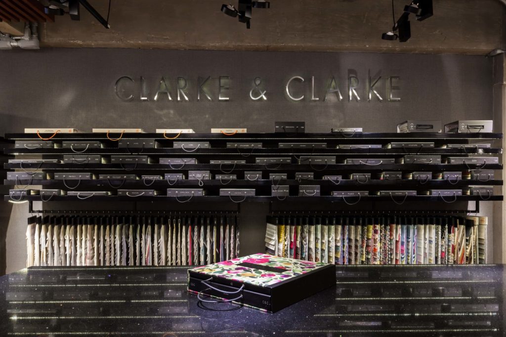
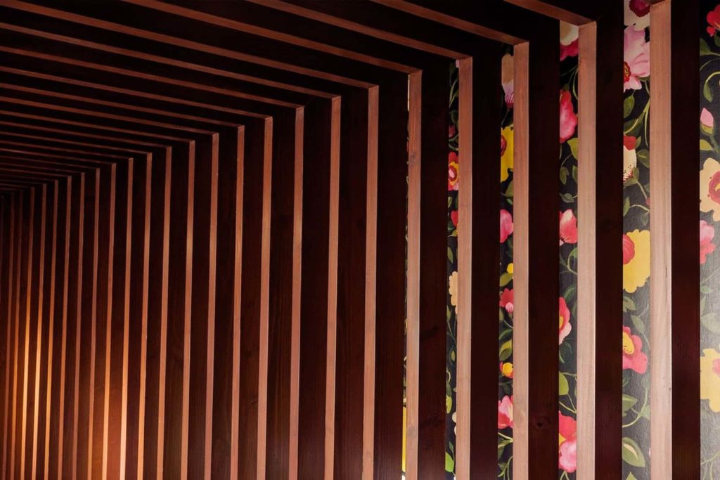
MATERIAL EXPRESSION

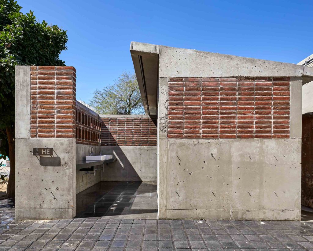
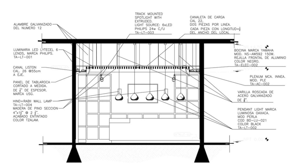
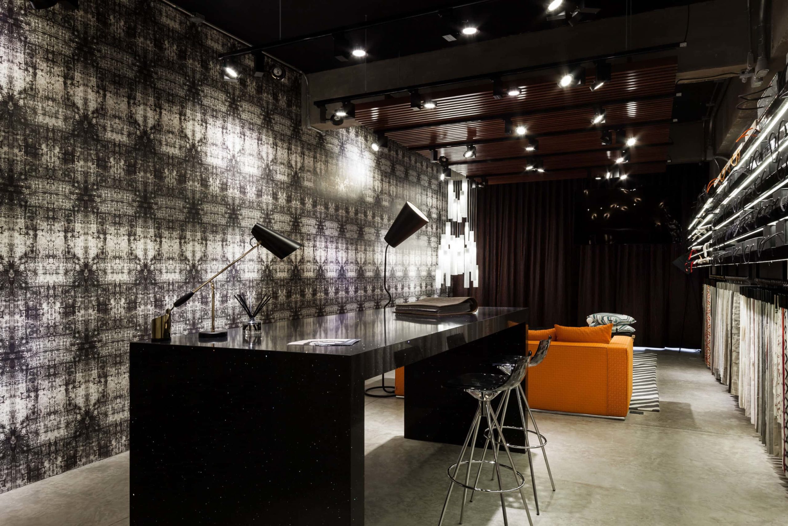
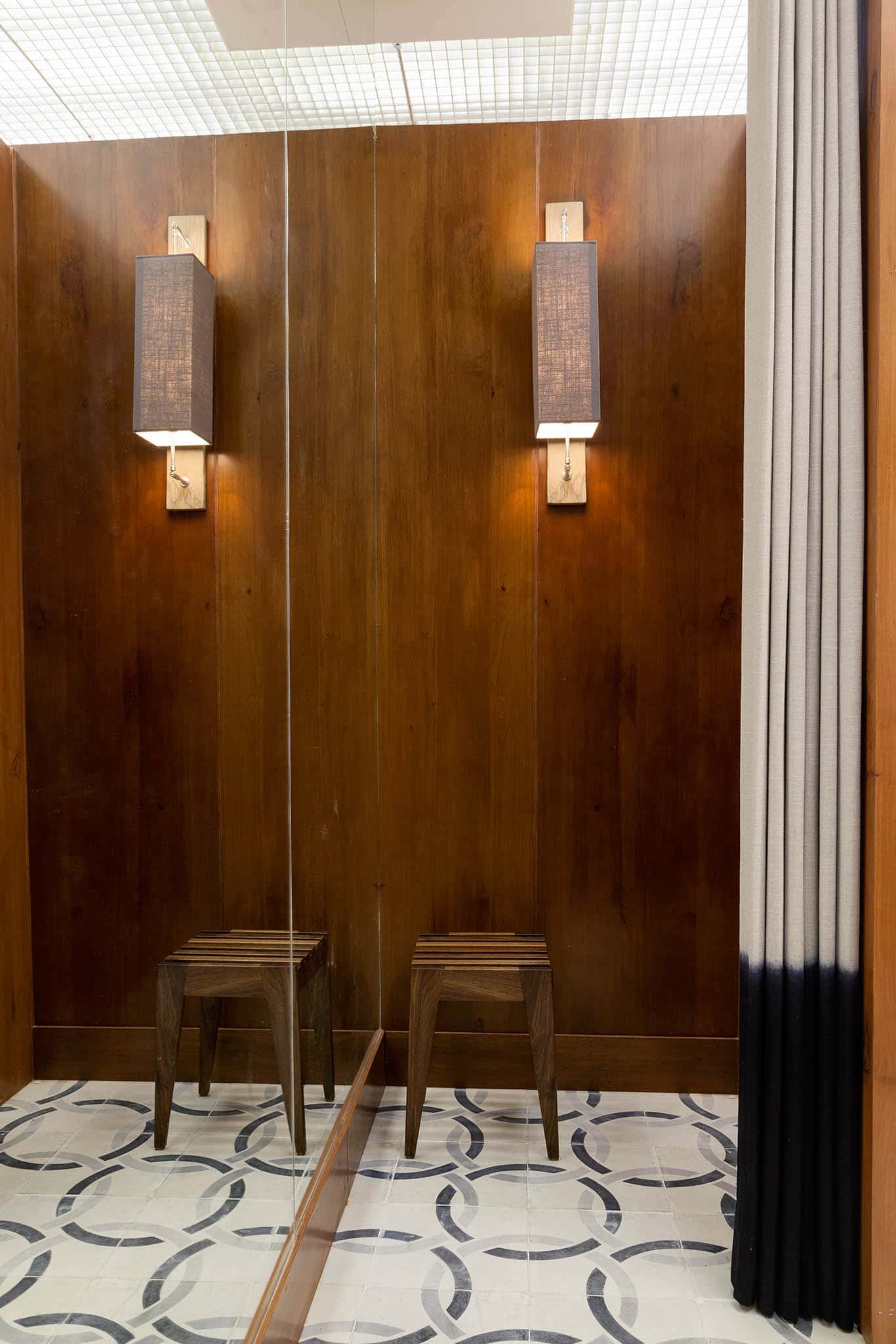
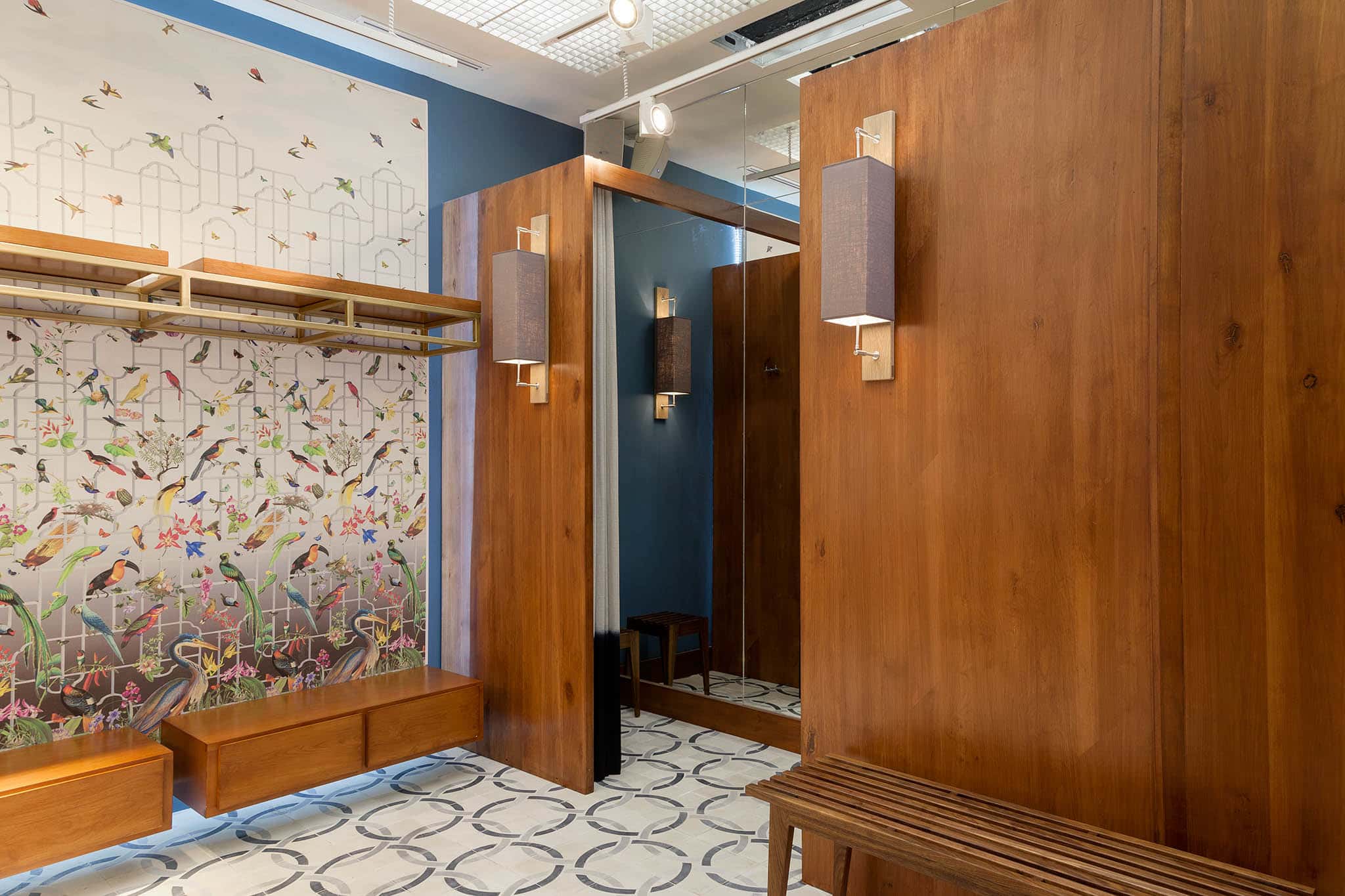
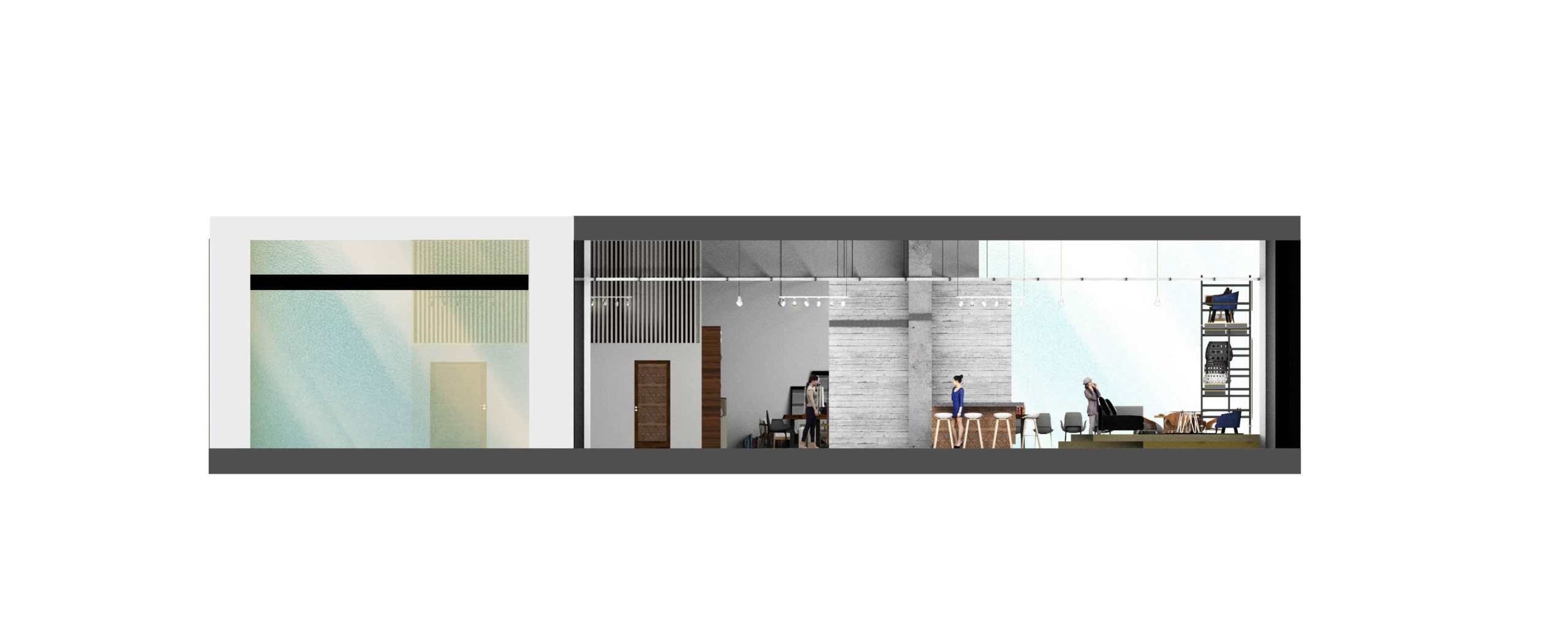
Exposed concrete and brick were selected not only for durability, but for character. Their textures age naturally under the Baja sun, creating a subtle dialogue between permanence and climate. The material palette remains restrained, allowing proportion and shadow to define the experience.
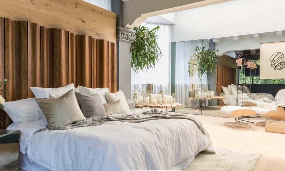
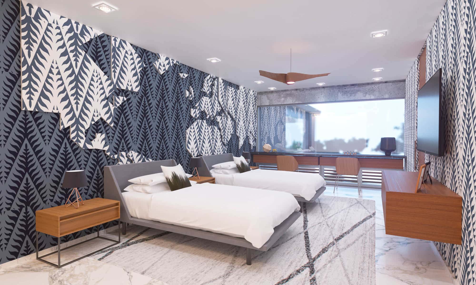
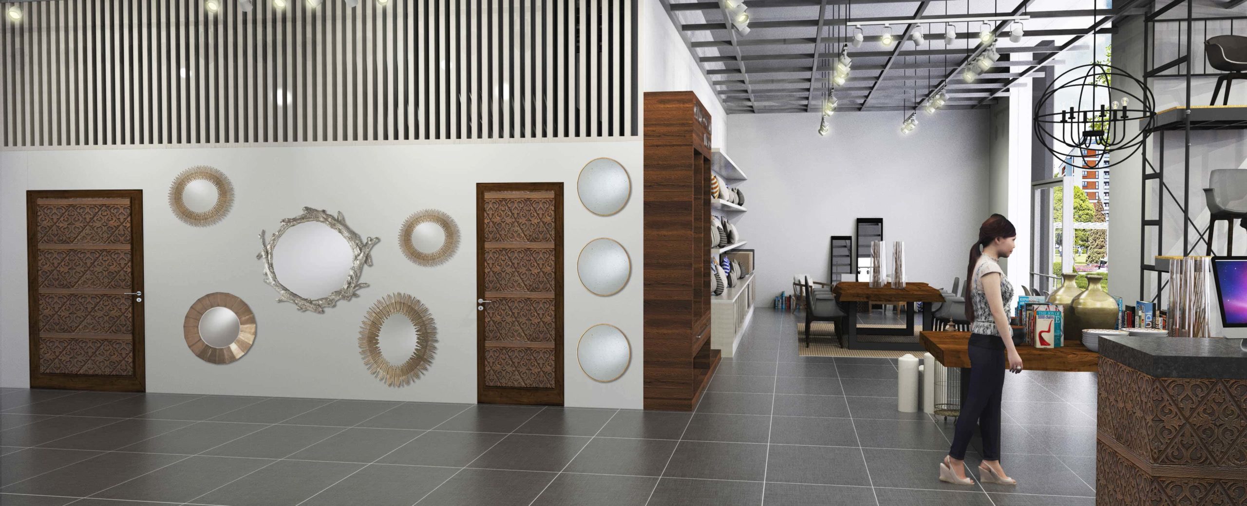
FUNCTIONAL CLARITY

Every line is intentional. Circulation is direct, fixtures are cleanly integrated, and detailing is understated. The result is a space that elevates a utilitarian program through thoughtful design—where simplicity becomes the strongest gesture.

COFER STUDIO PUEBLA

COFER STUDIO PUEBLA

A CURATED EXPERIENCE OF TEXTURE & LIGHT

“Design is not only about what you see, but about how material, light, and space interact to create a sensory experience.”

The Puebla showroom was conceived as an immersive environment where textiles, wallcoverings, and lighting coexist within a refined architectural framework. Rather than a conventional retail space, the design embraces the atmosphere of a contemporary design gallery.

Dark surfaces, controlled lighting, and linear displays create a backdrop that allows pattern and texture to take center stage.

LIGHT AS ACCENT

Lighting plays a dual role — functional and sculptural. Suspended fixtures and directional spots highlight curated moments while creating intimacy within the elongated layout.

The glow becomes part of the narrative, reinforcing the idea that illumination is not an accessory, but an integral design element.

A SETTING FOR SELECTION

Central worktables and lounge areas were integrated to encourage conversation and creative exploration. The layout supports designers and clients in a process of discovery — allowing fabrics and finishes to be experienced, compared, and appreciated in context.

The showroom becomes a space of interaction rather than transaction.

A DIALOGUE OF PATTERN & DEPTH

PERSIANISSIMA STORE

PERSIANISSIMA STORE

A CONTEMPORARY SHOWROOM FOR WINDOW SHADES

“Light is not only something we filter — it is something we design.”

The interior was conceived as a refined and structured setting to showcase premium window treatments. Rather than competing with the product, the architecture frames it — allowing blinds and shades to become the true protagonists of the space.

TEXTURE & LIGHT CONTROL

Natural stone, marble surfaces, and vertical wood slats create a balanced environment that echoes the essence of window systems: structure, rhythm, and filtered light. The spatial composition subtly references the idea of layering and modulation — core qualities of high-end blinds and shades.

DISPLAY WITH PURPOSE

Integrated lighting highlights materials and mechanisms, emphasizing precision and craftsmanship. Every wall and surface was designed to support presentation, consultation, and material selection in a calm, elevated atmosphere.

ARCHITECTURAL BACKDROP

OROTINTO WINE BAR

OROTINTO WINE BAR

A REFINED IDENTITY ROOTED IN WINE CULTURE

“Branding is not only about identity — it’s about creating an atmosphere people can taste, feel, and remember.”

For Orotinto Wine Bar, the creative direction focused on crafting a timeless and sophisticated identity. The branding was conceived to reflect the culture of wine — elegant, intimate, and deeply sensory.

A visual language was developed around simplicity, balance, and subtle symbolism, allowing the brand to feel refined yet approachable.

VISUAL CHARACTER

The logo system combines clean typography with a minimal graphic gesture inspired by the ritual of pouring wine. The restrained palette — black, white, deep tones and subtle gold accents — reinforces a sense of exclusivity and warmth.

Every element was designed to feel intentional, from printed materials to menu layouts, ensuring coherence across touchpoints.

EXPERIENCE THROUGH DETAIL

Texture, paper selection, and layout composition were considered essential parts of the brand experience. The result is a visual identity that feels tactile, curated, and aligned with the atmosphere of a contemporary wine bar.

HOUSE CLN 410

HOUSE CLN 410

FRAMING STILLNESS

Architecture becomes powerful when simplicity carries intention.

A residence defined by pure geometry and quiet strength.

Bold volumes frame expansive glass openings, allowing interior and exterior to coexist in perfect balance. Concrete and warm wood surfaces create contrast without tension, shaping spaces that feel intentional, grounded, and refined.

QUIET INTENTION

A contemporary sanctuary shaped by proportion and presence.

Strong architectural lines meet open transparency, creating a dialogue between solidity and lightness. The material palette feels restrained yet expressive, allowing the architecture itself to speak.

CLARITY BY DESIGN

A home conceived as a retreat from noise — structured, serene, timeless.

“true luxury lives in clarity.”

MEASURED SIMPLICITY | DEFINED BY INTENTION

ARTESANO AT SHERATON GRAND

ARTE SANO AT THE SHERATON GRAND

WHEN CULTURE BECOMES EXPERIENCE

“Design should honor culture while shaping a new context for it to evolve.”

Arte Sano was conceived as more than a retail space — it is an immersive expression of Mexican craftsmanship within an international hospitality setting. The design balances vibrancy and sophistication, allowing tradition to coexist seamlessly with a contemporary architectural language.

Natural wood shelving structures frame the space with warmth, while bold chromatic accents create a memorable visual rhythm.

Every element was carefully orchestrated to highlight the richness of the pieces on display without overwhelming them.

CRAFT MEETS CURATION

Display was approached as composition. Open shelving, layered heights, and focal lighting allow each handcrafted object to breathe while still forming part of a cohesive visual narrative.

Rather than designing a store filled with objects, the intention was to create a curated environment — one that elevates craftsmanship through thoughtful proportion, texture, and contrast.

A CONTEMPORARY MEXICAN NARRATIVE

The deep magenta walls and golden backlit niches establish a strong cultural presence, referencing the intensity and joy often found in Mexican artisan traditions. At the same time, clean lines, glass pendant lighting, and precise spatial organization provide clarity and elegance.

The large-scale mural anchors the store with a sense of place — connecting heritage, storytelling, and modern retail dynamics in a single gesture.

IDENTITY THROUGH DESIGN

STA MARINA AT THE SHERATON GRAND

STA MARINA AT THE SHERATON GRAND

RETAIL, REIMAGINED WITHIN HOSPITALITY

“When architecture frames experience, retail becomes ritual.”

Designed as an organic extension of its hospitality context, the space dissolves the boundary between destination and discovery. It feels less like a store — and more like a pause within the journey.

A BOUTIQUE THAT BREATHES WITH THE HOTEL

The project reflects a refined commercial vision: expressive yet controlled, immersive yet balanced — a retail space shaped by proportion, warmth, and intentional restraint.

MOOD

Warm wood volumes define thresholds, guide movement, and sculpt intimacy. Vertical rhythm and crafted detailing transform circulation into an architectural gesture rather than a mere pathway.

TIMBER AS STRUCTURE, TIMBER AS STORY

CLARKE & CLARKE

CLARKE & CLARKE

A REFINED CANVAS FOR BRITISH TEXTILES

“A well-designed space should never compete with the product—it should elevate it.”

Clarke & Clarke, the renowned British textile house known for its expressive patterns and refined fabric collections, required a retail environment that felt both contemporary and timeless.

The design approach focused on translating the brand’s heritage into a spatial experience—clean, architectural, and quietly sophisticated—allowing the textiles to become the true protagonists.

TEXTURE AS ARCHITECTURE

Rather than overwhelming the space, the interior was conceived as a neutral canvas. Stone finishes, warm wood flooring, and restrained wall treatments frame the collections without competing with them.

Large-format display walls transform fabrics into vertical compositions—almost like curated art installations—highlighting color, pattern, and craftsmanship.

A TACTILE EXPERIENCE

The layout encourages interaction. Generous central tables invite clients to sit, explore samples, and engage with materials in a tactile and intuitive way.

Shelving systems and modular displays allow flexibility, supporting seasonal collections while maintaining visual order and balance.

A SPACE THAT FRAMES DESIGN

SCHWABINGER MUNICH

SCHWABINGER MUNICH

A CONTEMPORARY RETAIL ENVIRONMENT ROOTED IN CLARITY

“Retail spaces should not compete with what they display; they should quietly elevate it through proportion, material, and light.”

Designed as a modern interior design showroom in Munich, this project explored openness, structure, and spatial rhythm. The intention was to create a flexible commercial environment that could showcase furniture, textiles, and curated objects within a clean architectural framework.

SPATIAL STRUCTURE

The layout emphasizes fluid circulation and visual transparency. Architectural elements—columns, suspended lighting grids, and linear partitions—organize the space without overwhelming it. Display zones remain adaptable, allowing the interior to evolve with changing collections.

MATERIAL PALETTE

A restrained combination of wood, concrete textures, metal accents, and neutral surfaces defines the atmosphere. Warm timber volumes contrast with industrial ceilings, balancing sophistication with approachability.

RETAIL EXPERIENCE | ARCHITECTURAL FRAMEWORK

MODEL UNIT FOR THE SHERATON GRAND LOS CABOS

MODEL UNIT FOR THE SHERATON GRAND LOS CABOS

A REFINED EXPRESSION OF CABO LIVING

“Hospitality is the art of making atmosphere feel effortless.”

Conceived as a model environment within a luxury hospitality context, the proposal explores a refined interpretation of Cabo living — where warmth, light, and material restraint shape the guest experience.

WARMTH THROUGH STRUCTURE

Natural wood volumes anchor the bedroom with quiet architectural presence. Textured wall finishes and integrated lighting create depth without ornament, allowing proportion and composition to lead the space.

CABO, EDITED

The palette reflects a softened coastal sensibility — warm neutrals, oceanic blues, and subtle accents that echo the surrounding landscape. Rather than literal references, the design translates regional character into a contemporary hospitality language.

A PROPOSAL FOR ELEVATED LIVING